Graphic Design and Digital Art by Nabawia Elsoudani

This work is licensed under a Creative Commons Attribution-NonCommercial-NoDerivs 3.0 Unported License.
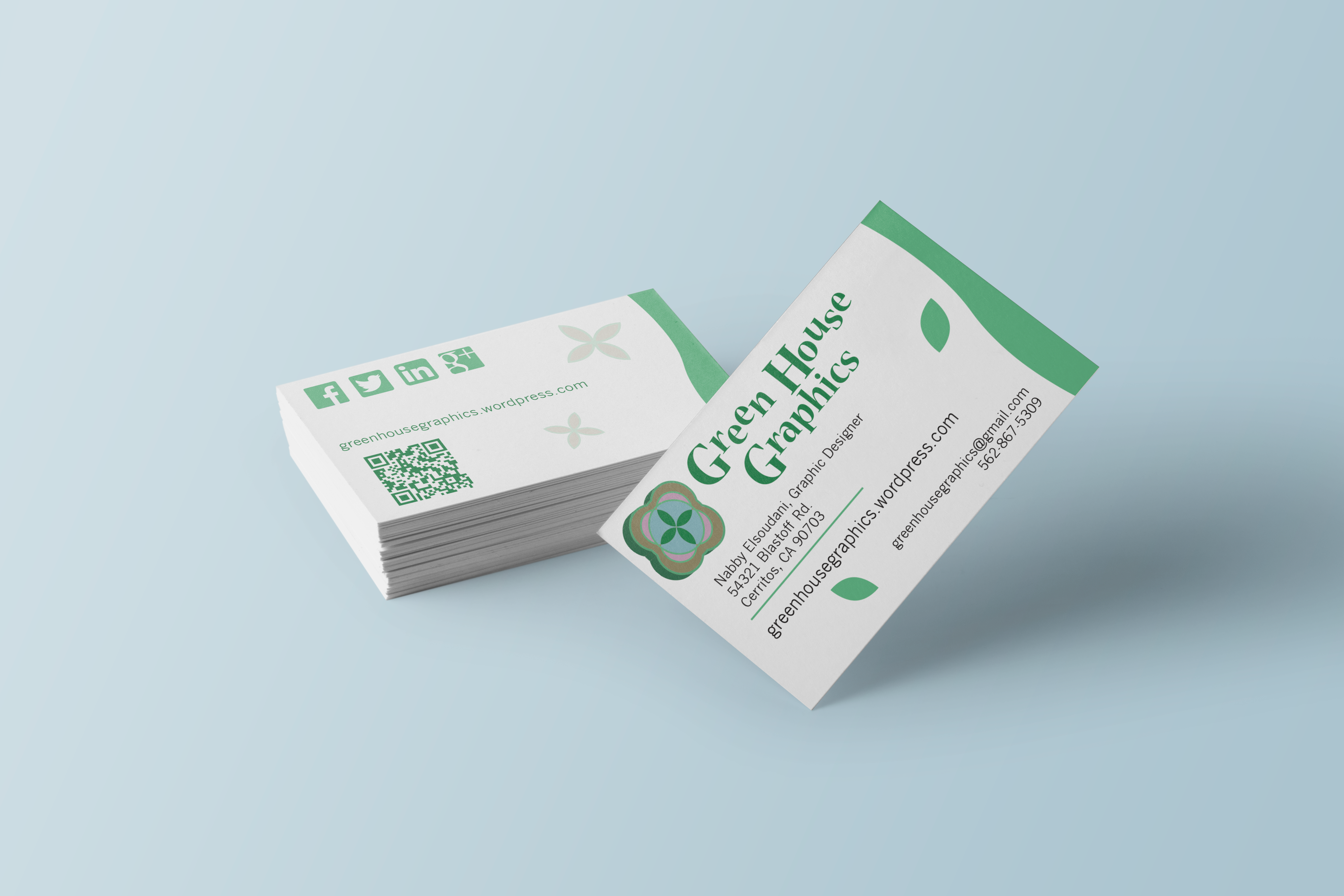
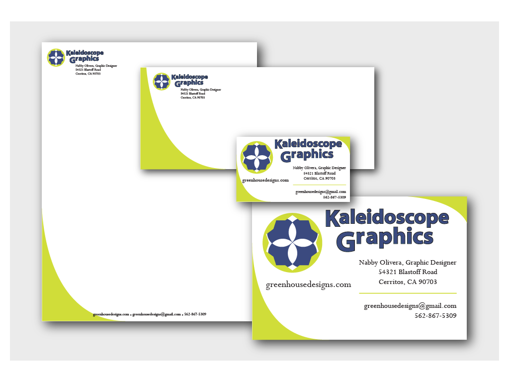
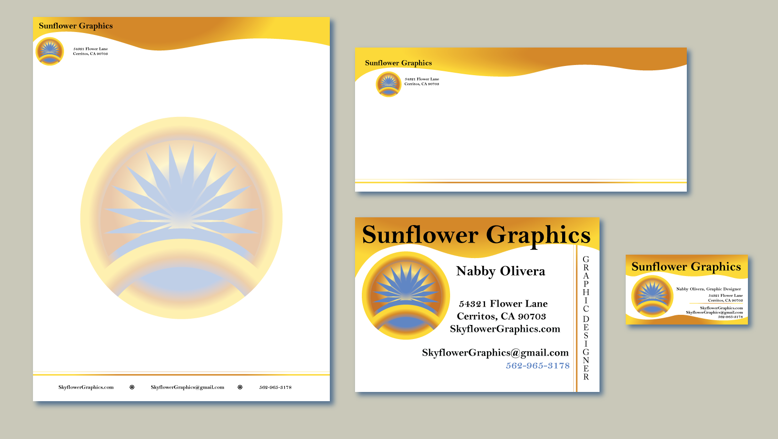
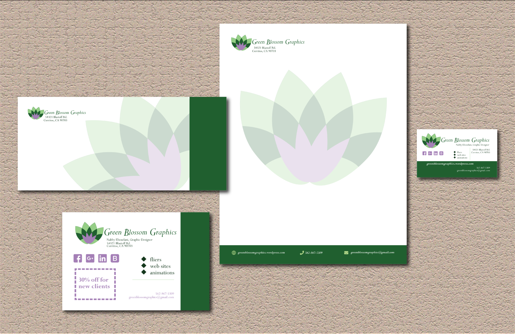
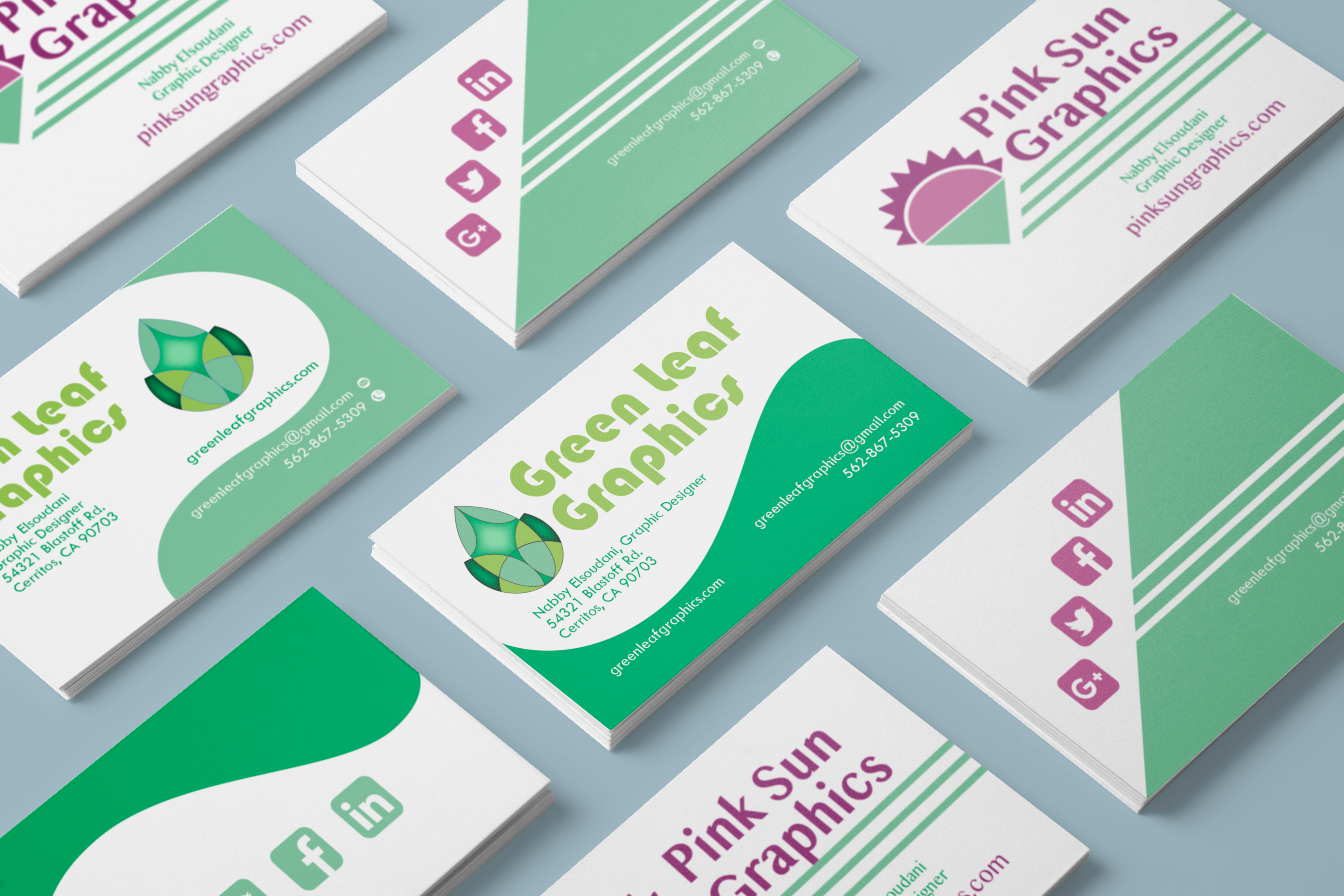
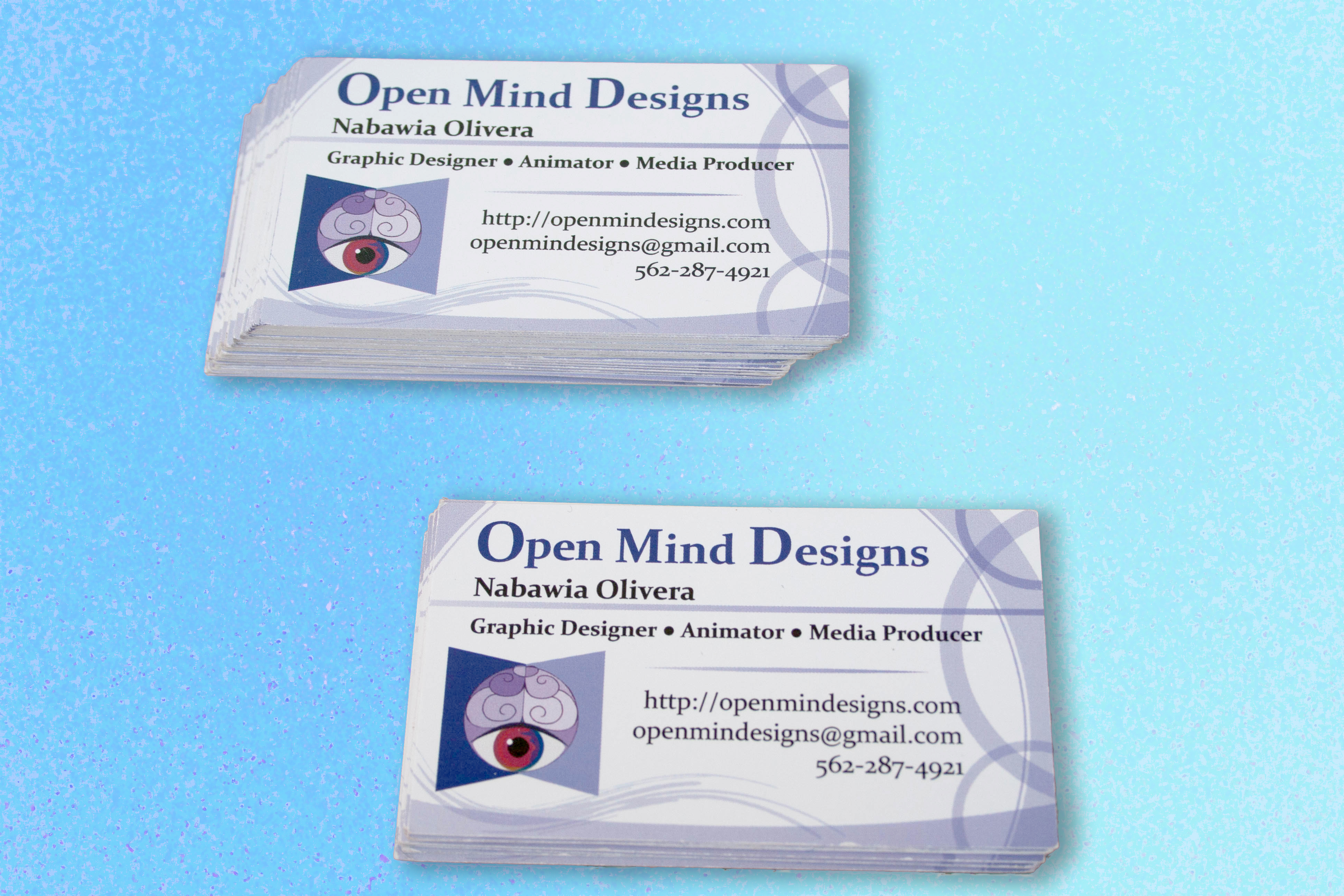
Logos and Business Card Design
When creating logos for branding campaigns I design multiple versions of a logo. I begin with a concept. I keep the design within the Golden Mean aspect ratio so that it is no more elongated than the aspect ratio of a standard business card. When I come up with a working design for a logo, I scale it down to a dime size to test if I am able to see all the essential details. If I lose some details, I decide either to strip them away for a more clean minimalist look or I exaggerate those details so they will be more noticeable if they are important to the concept of the design.
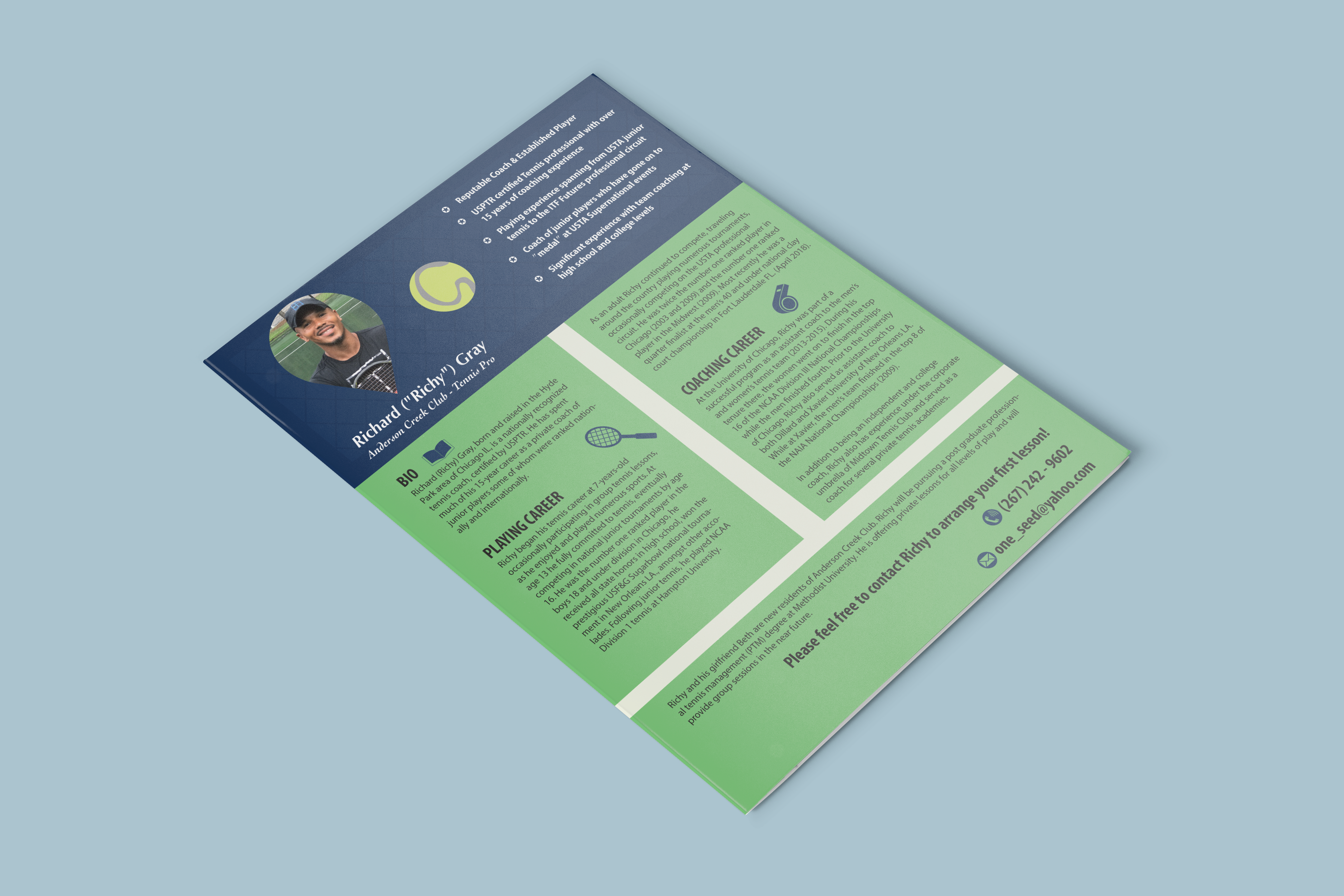
This is a resume I created for a professional tennis player, Richard Gray. The layout, logo and icons are all my original design using the tools in Adobe Illustrator. 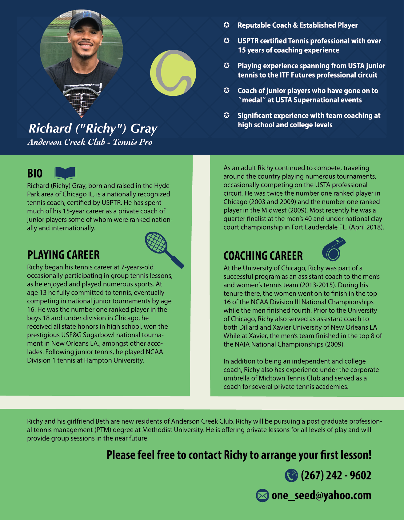
Richard Gray Resume 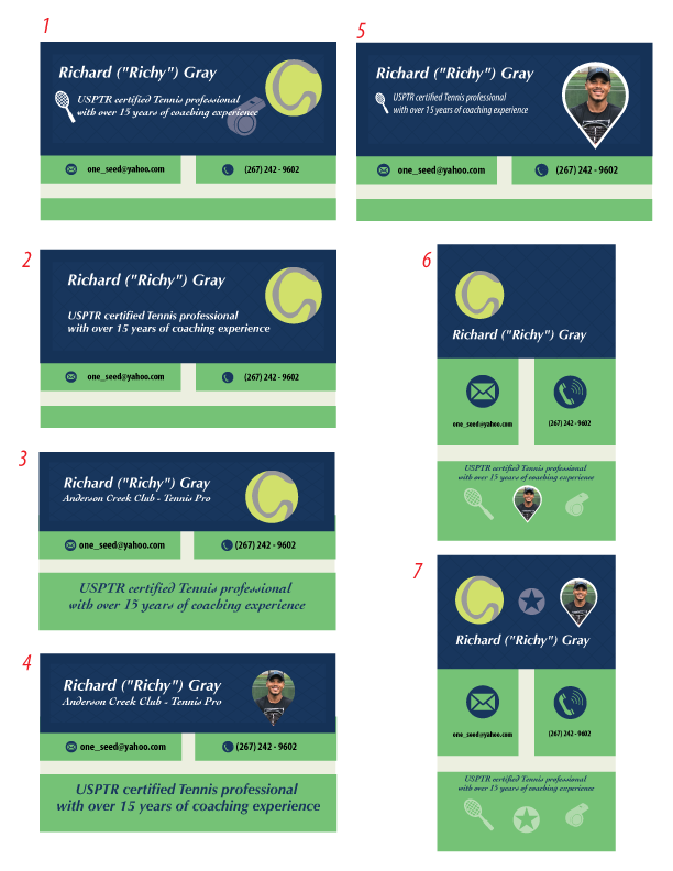
Business Card Layouts 
Richard Richy Gray Business Card Design 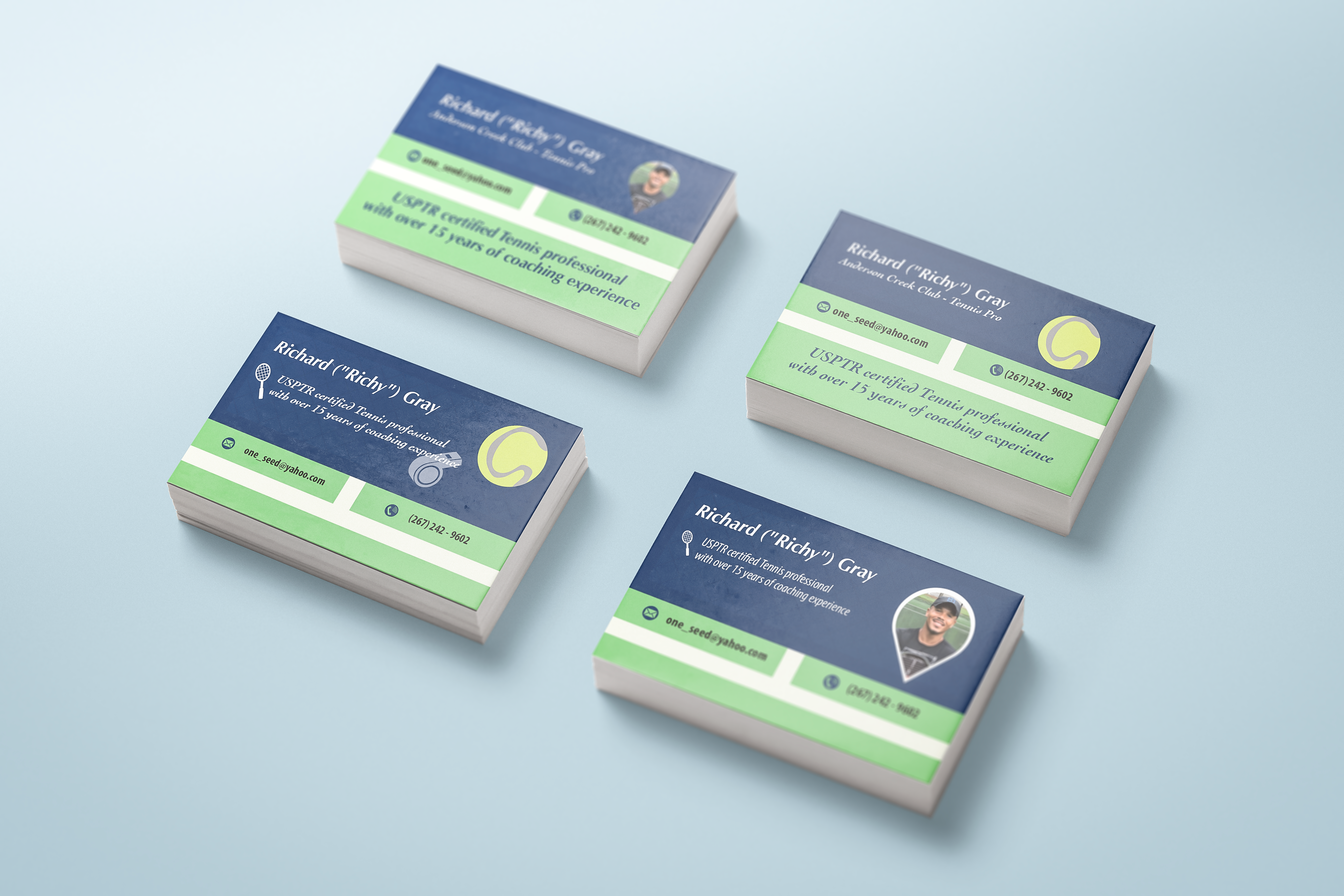
Business Cards for Tennis on Print 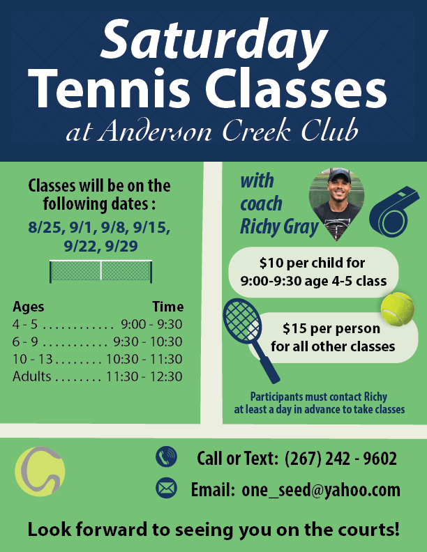
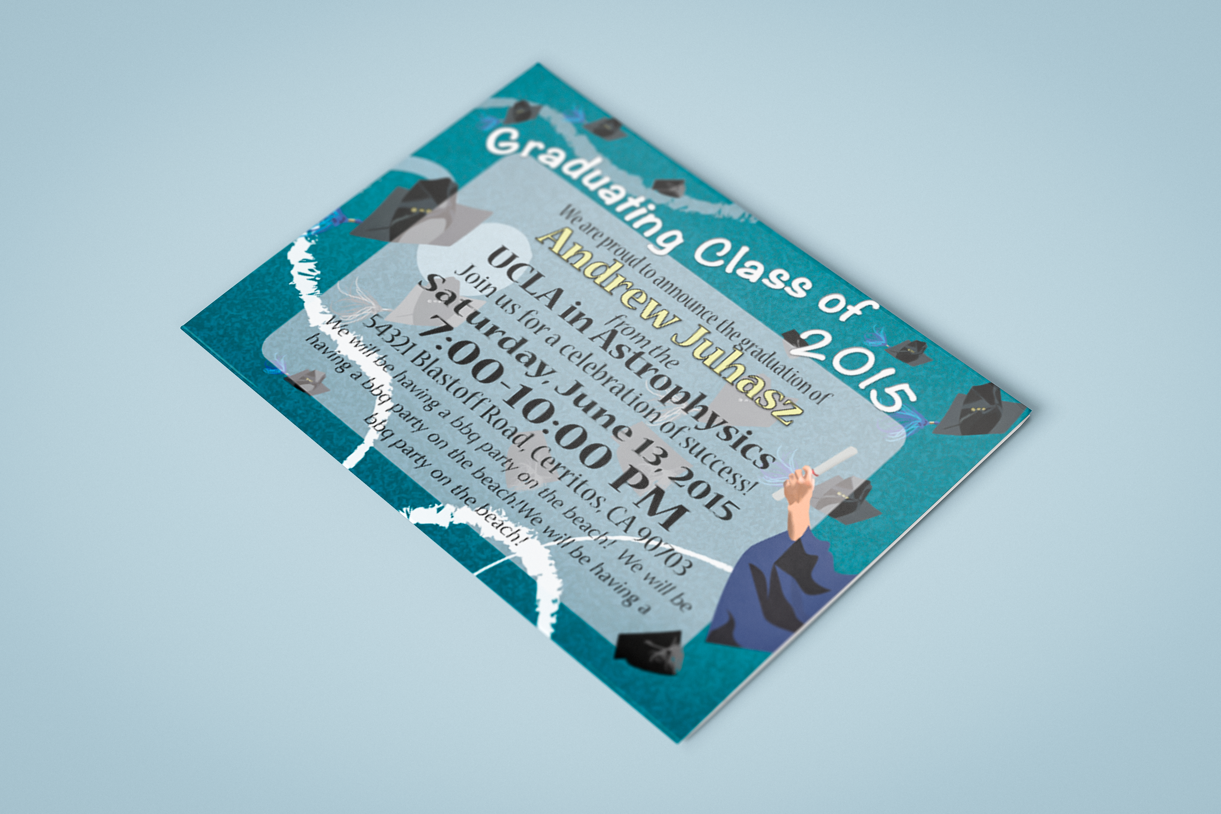
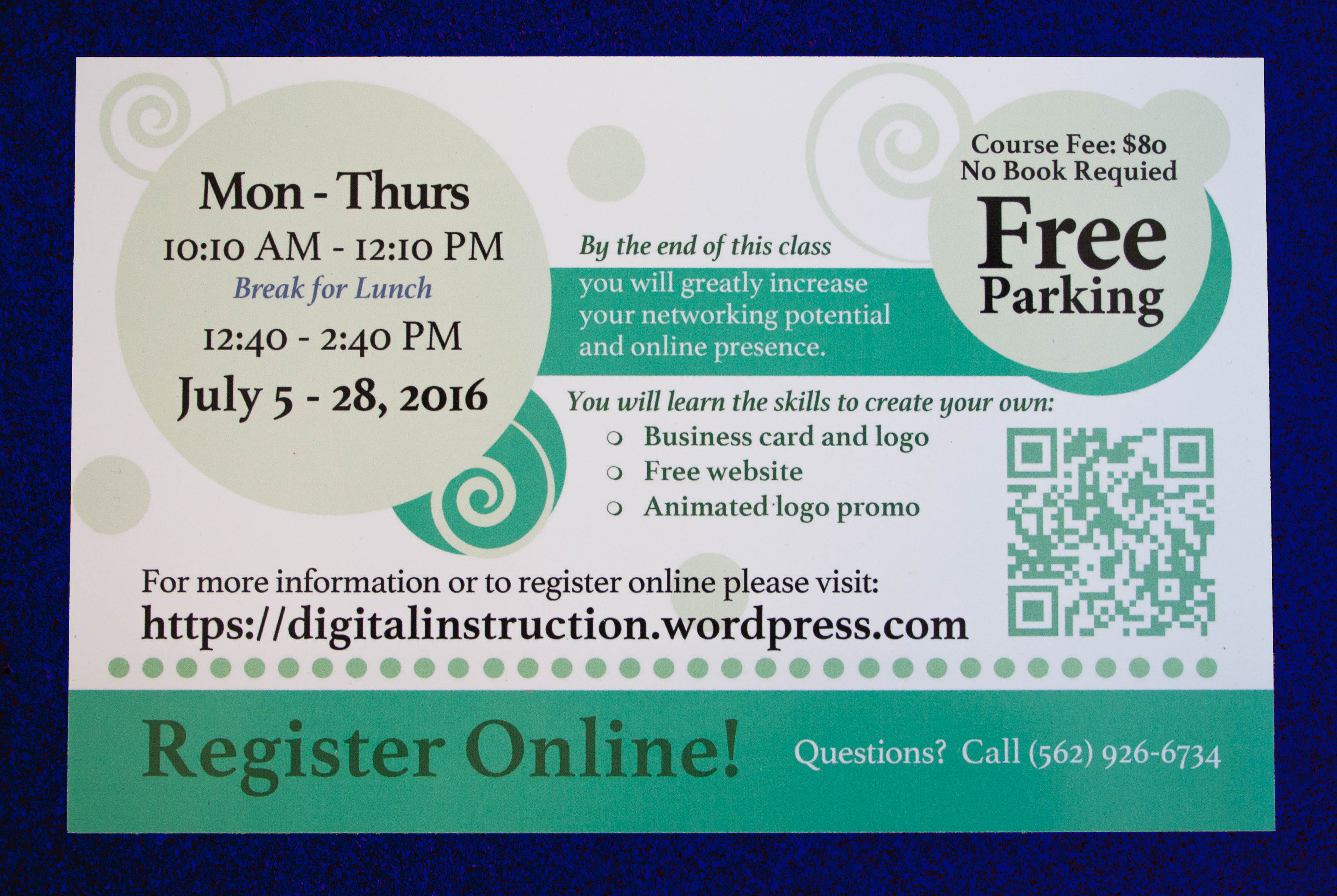
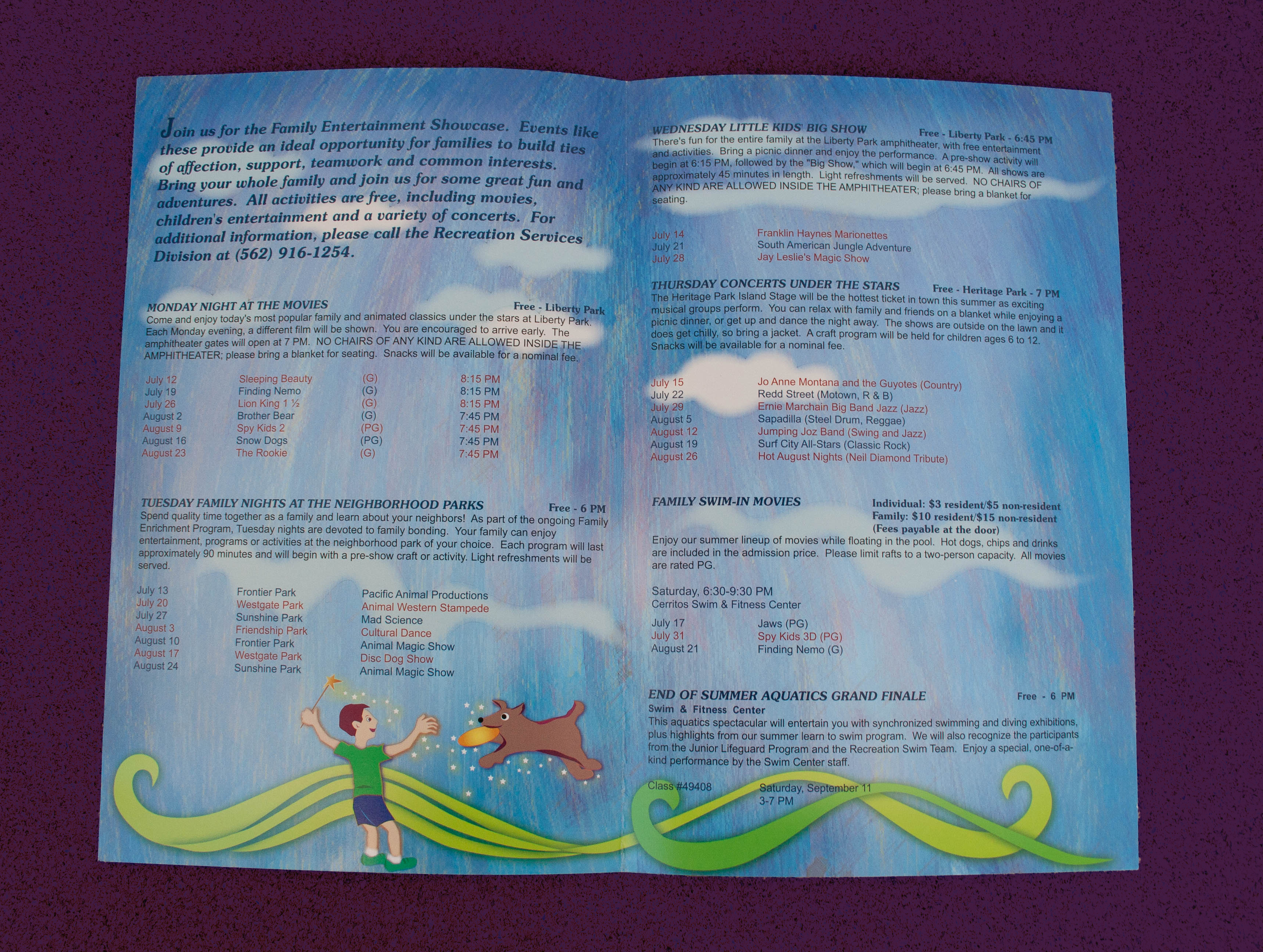
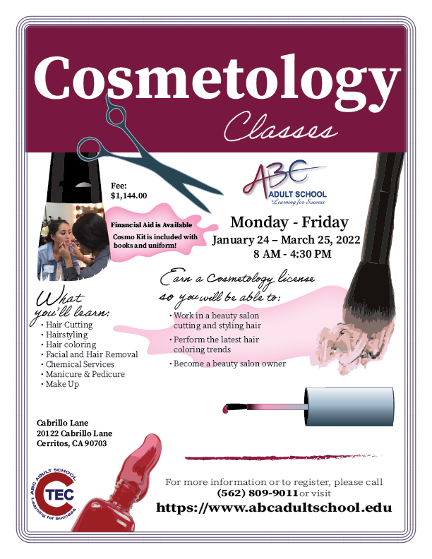
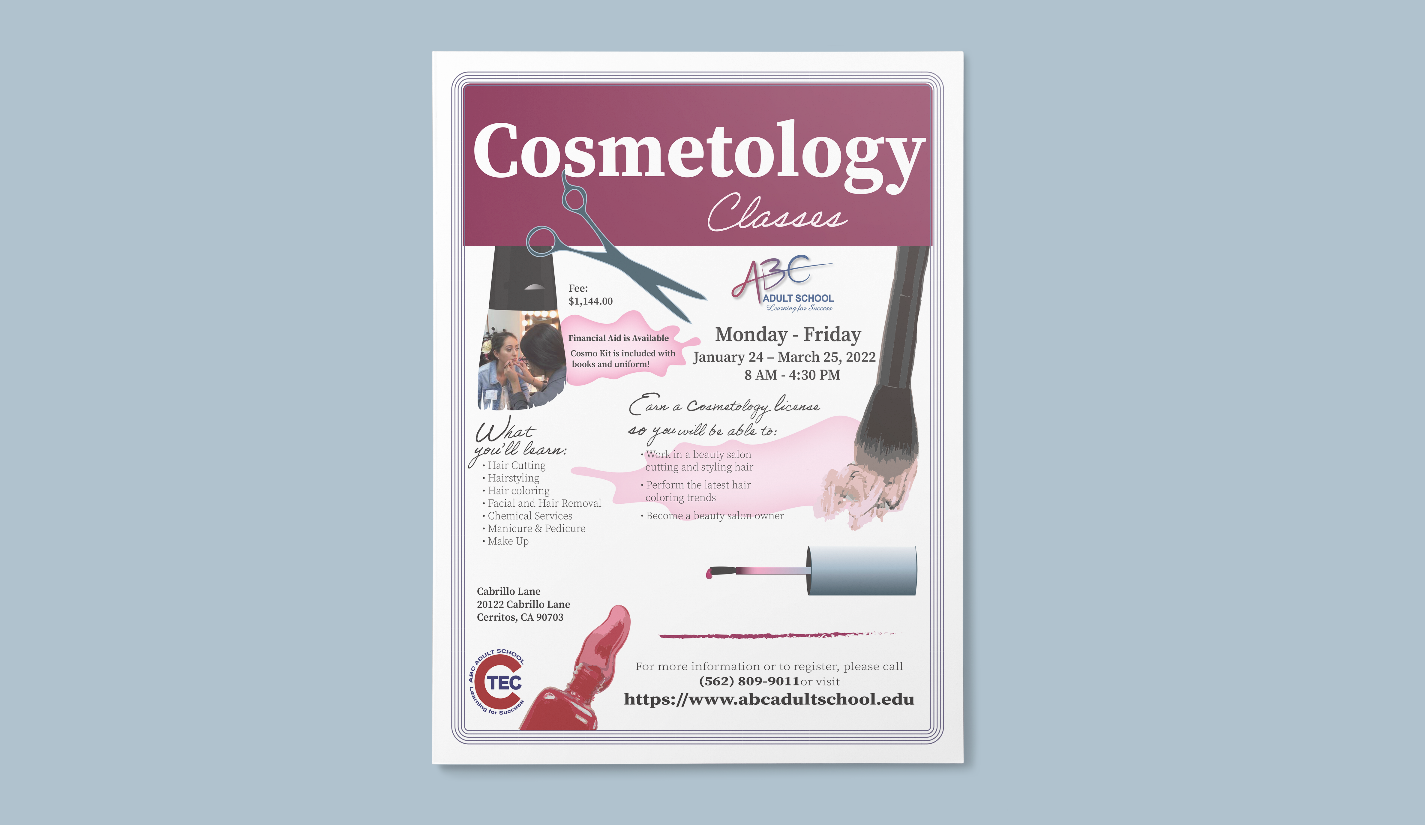
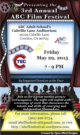
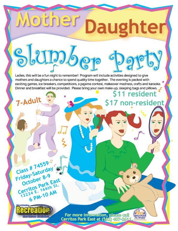
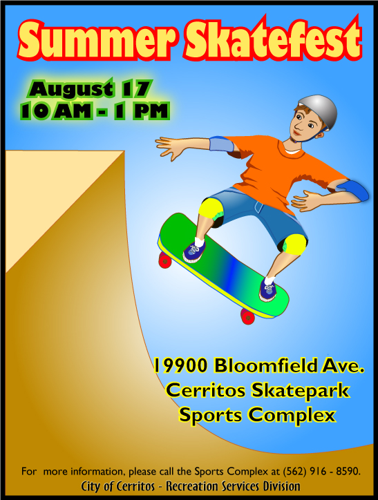
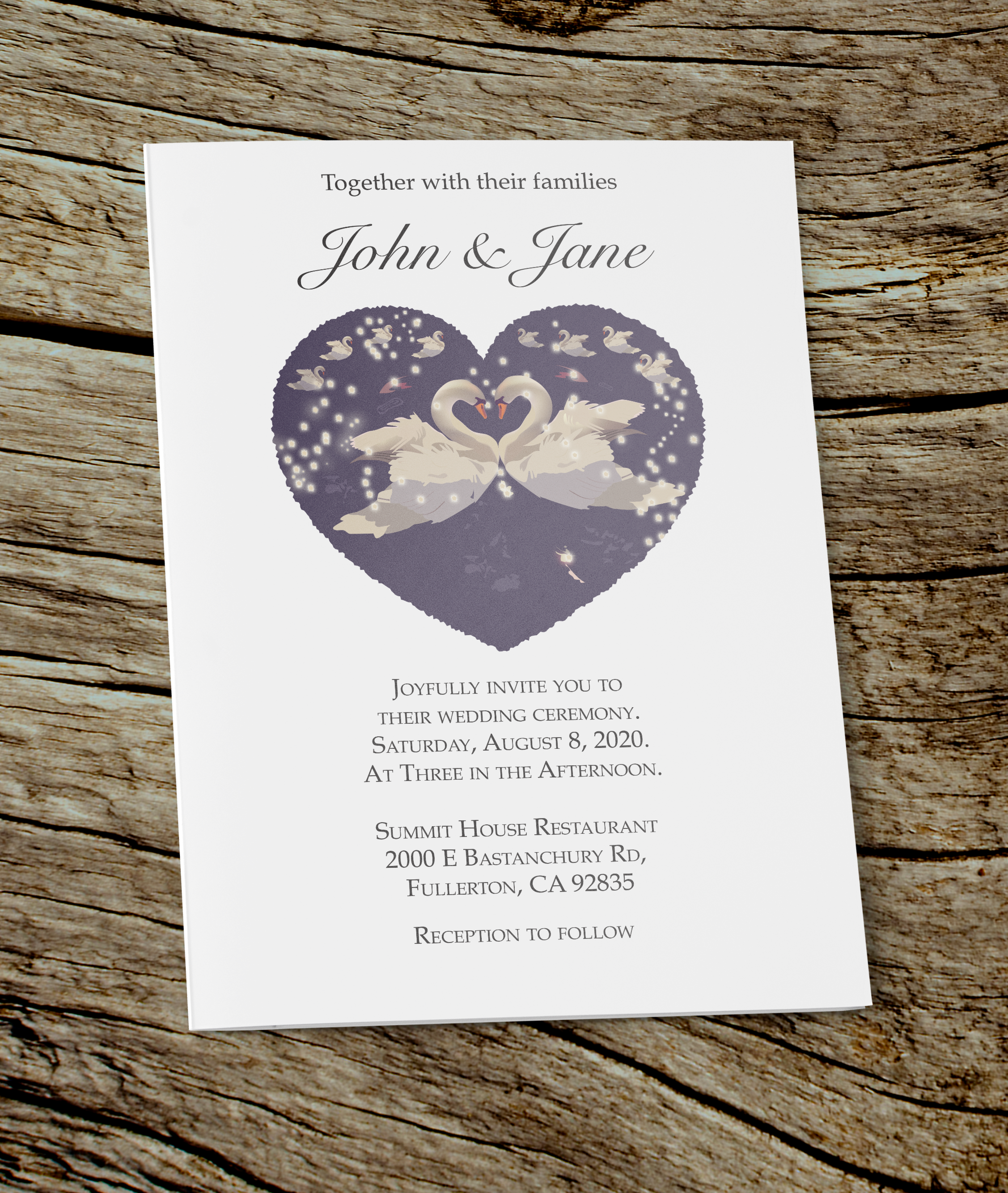
Tennis Class Flier 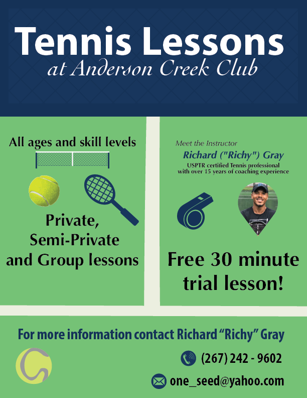
Tennis Class Flier 
Tennis Class Flier
Branding and Identity Packages
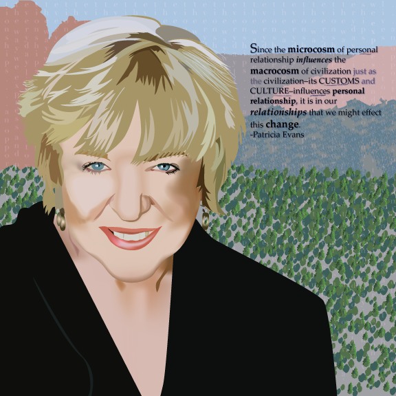
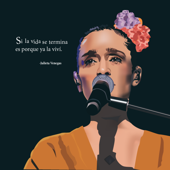
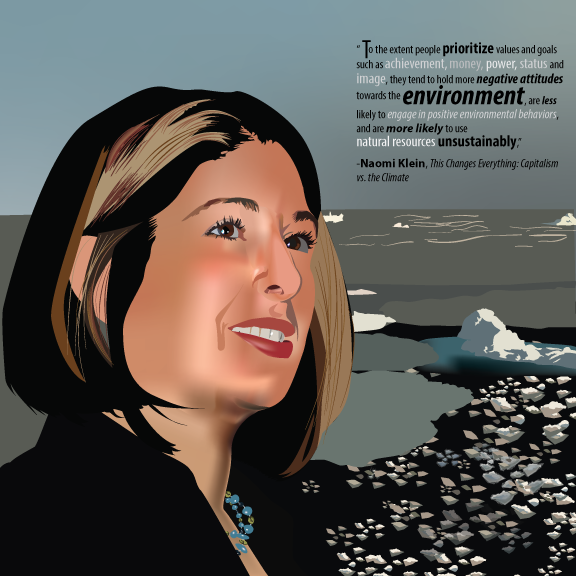
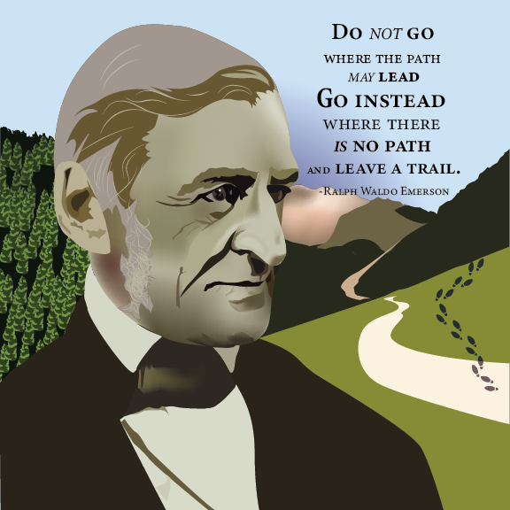
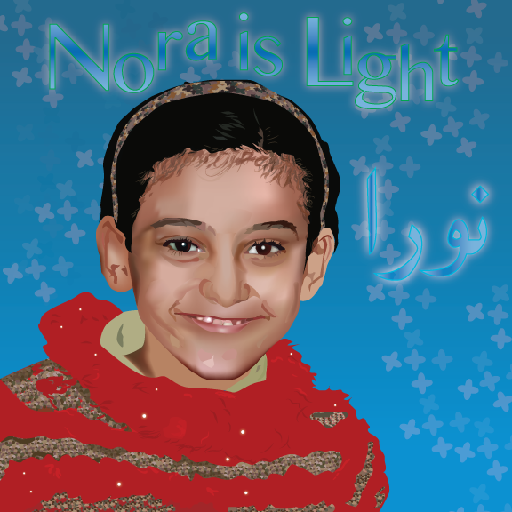
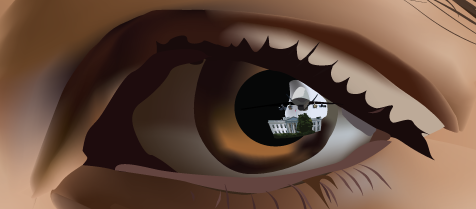
Portraits


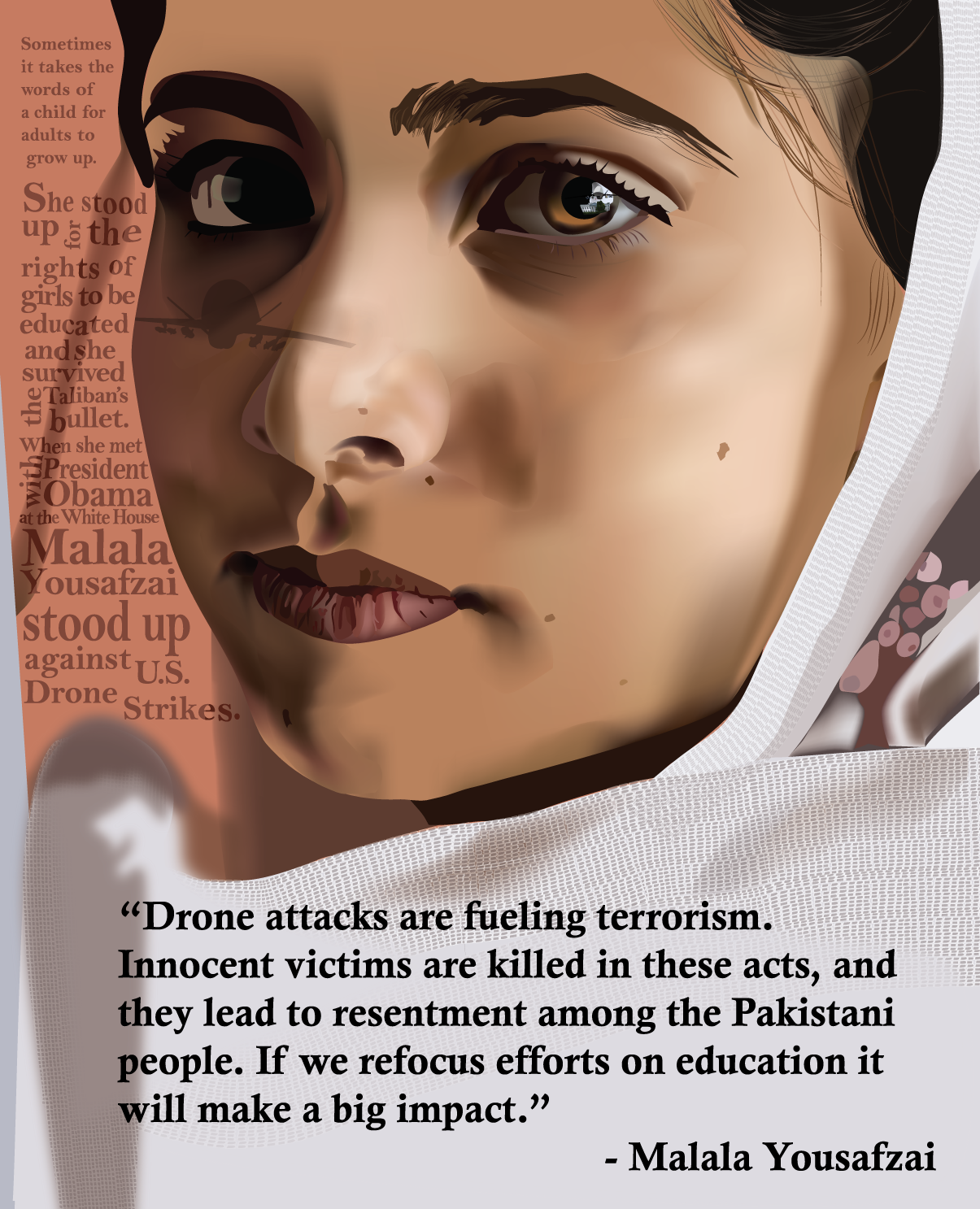
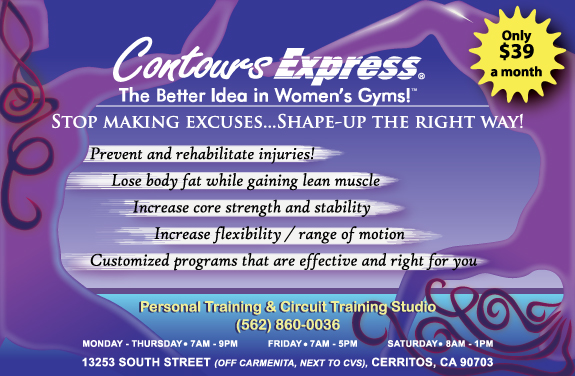
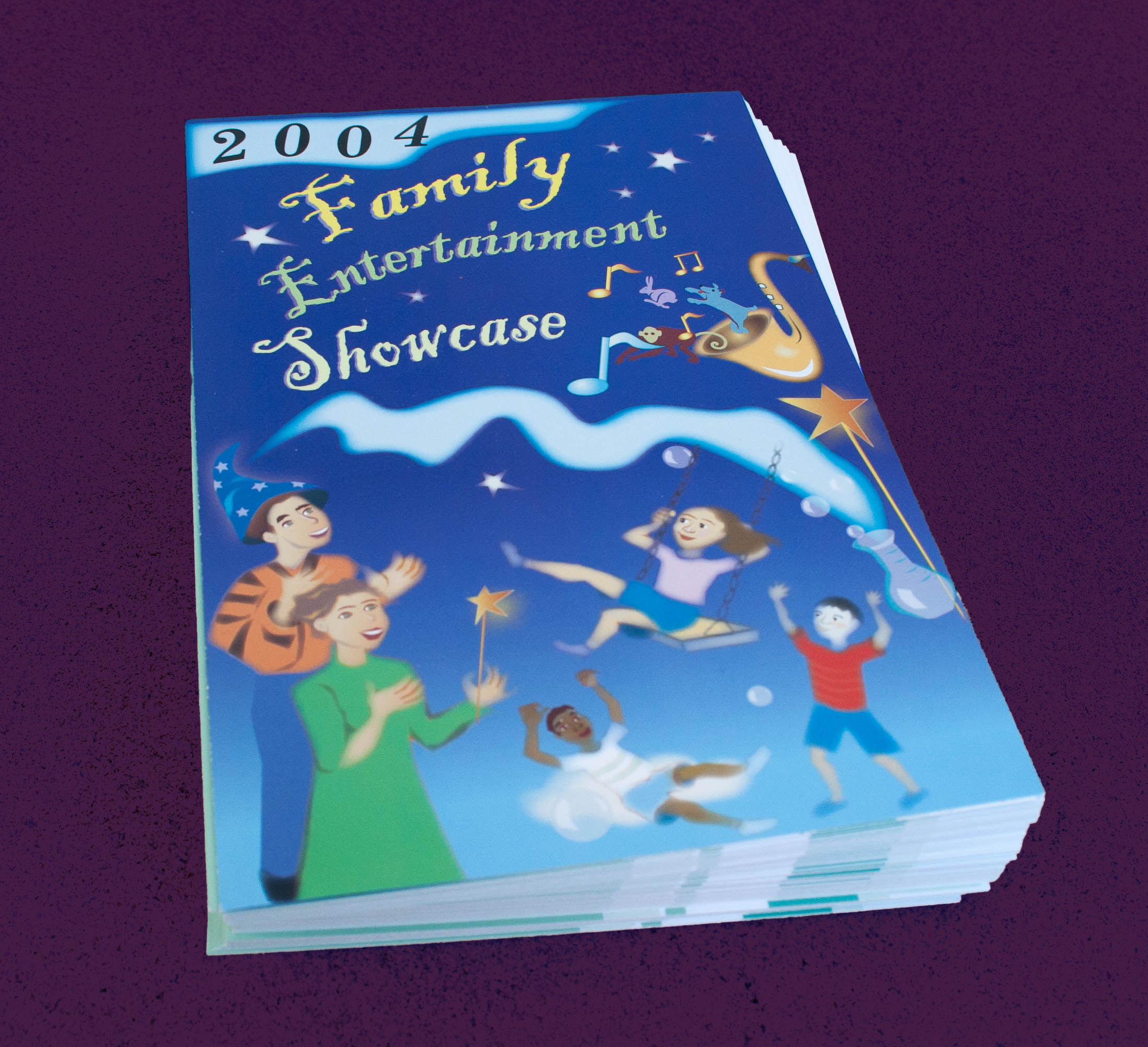
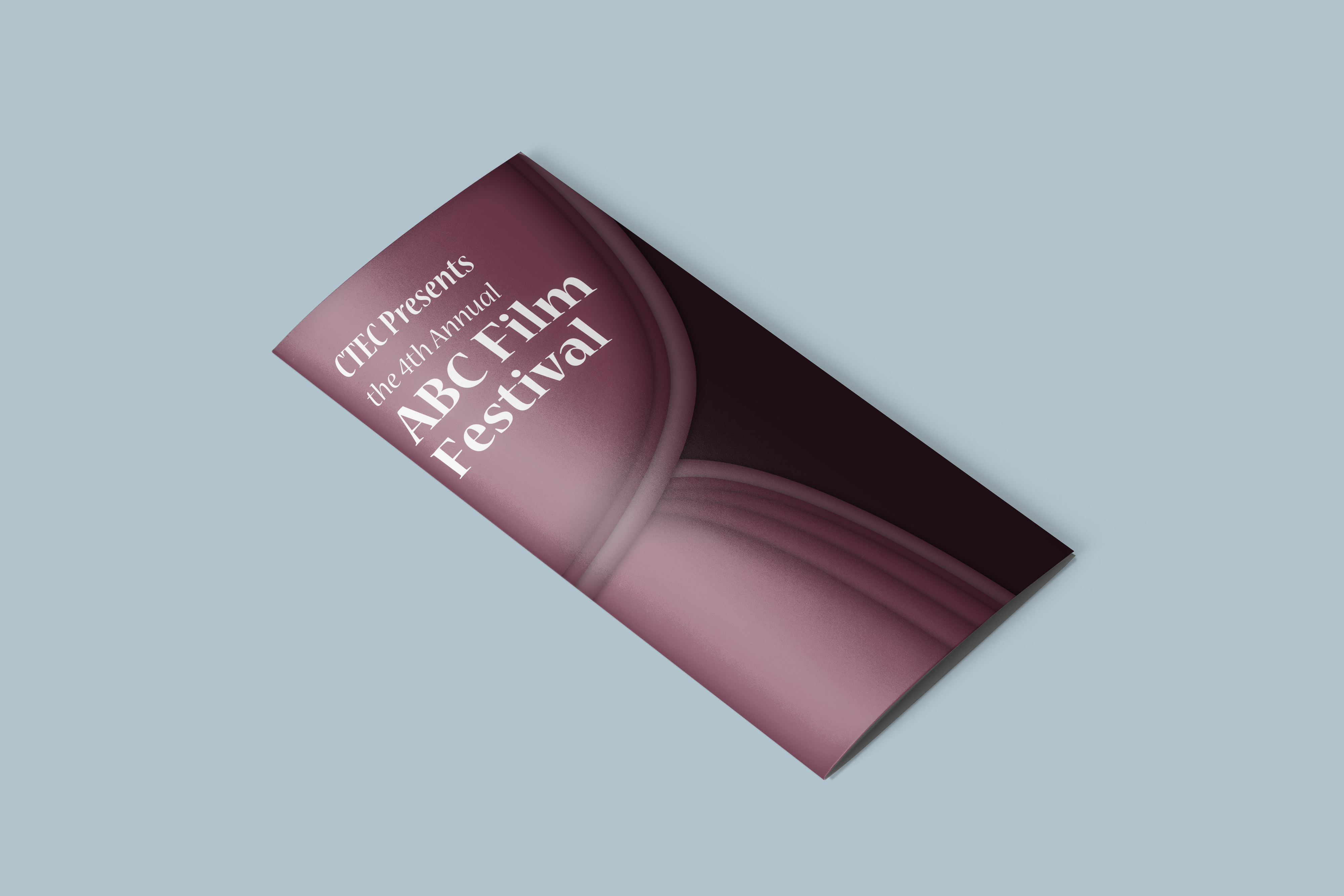
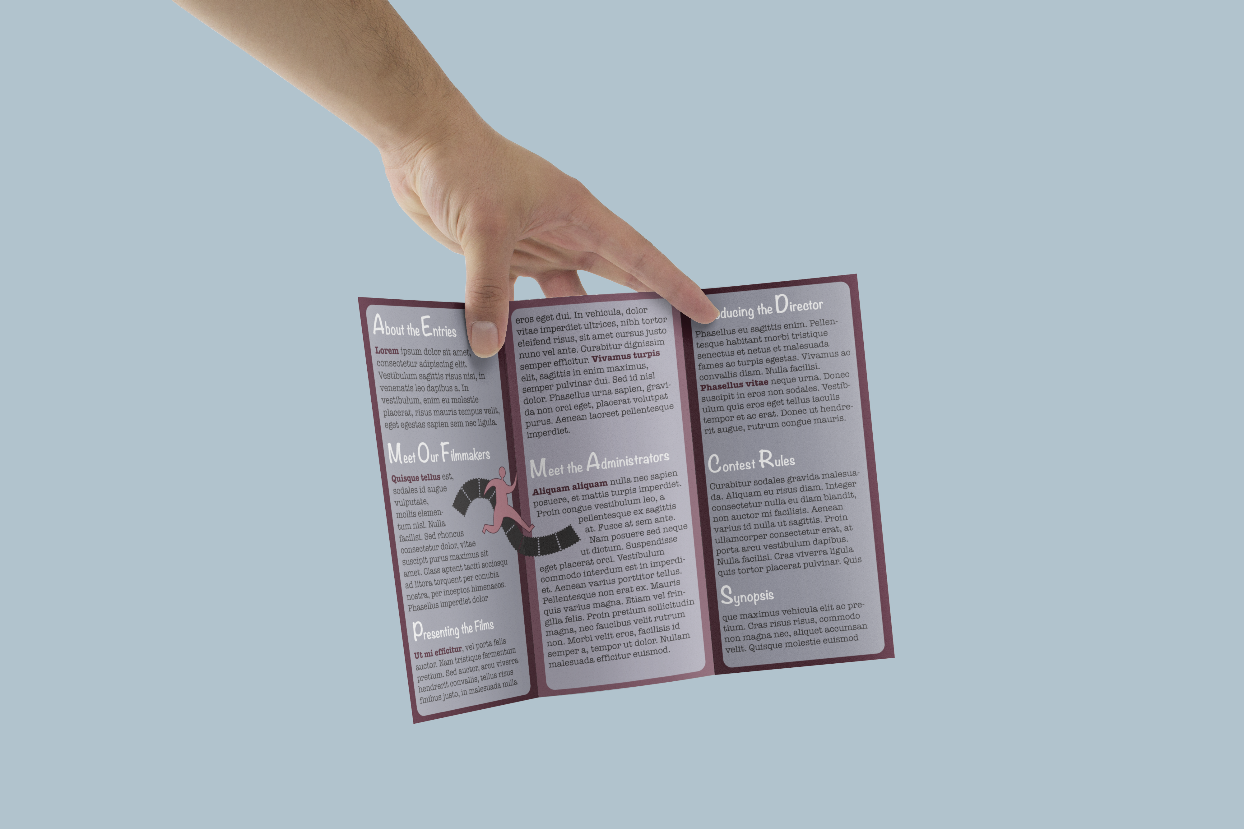
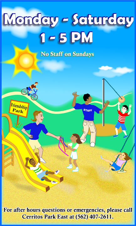
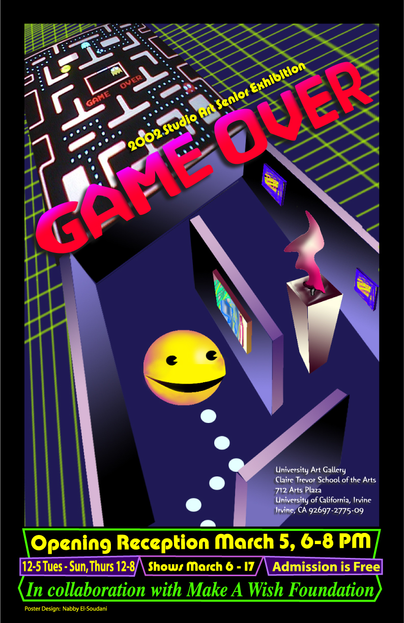
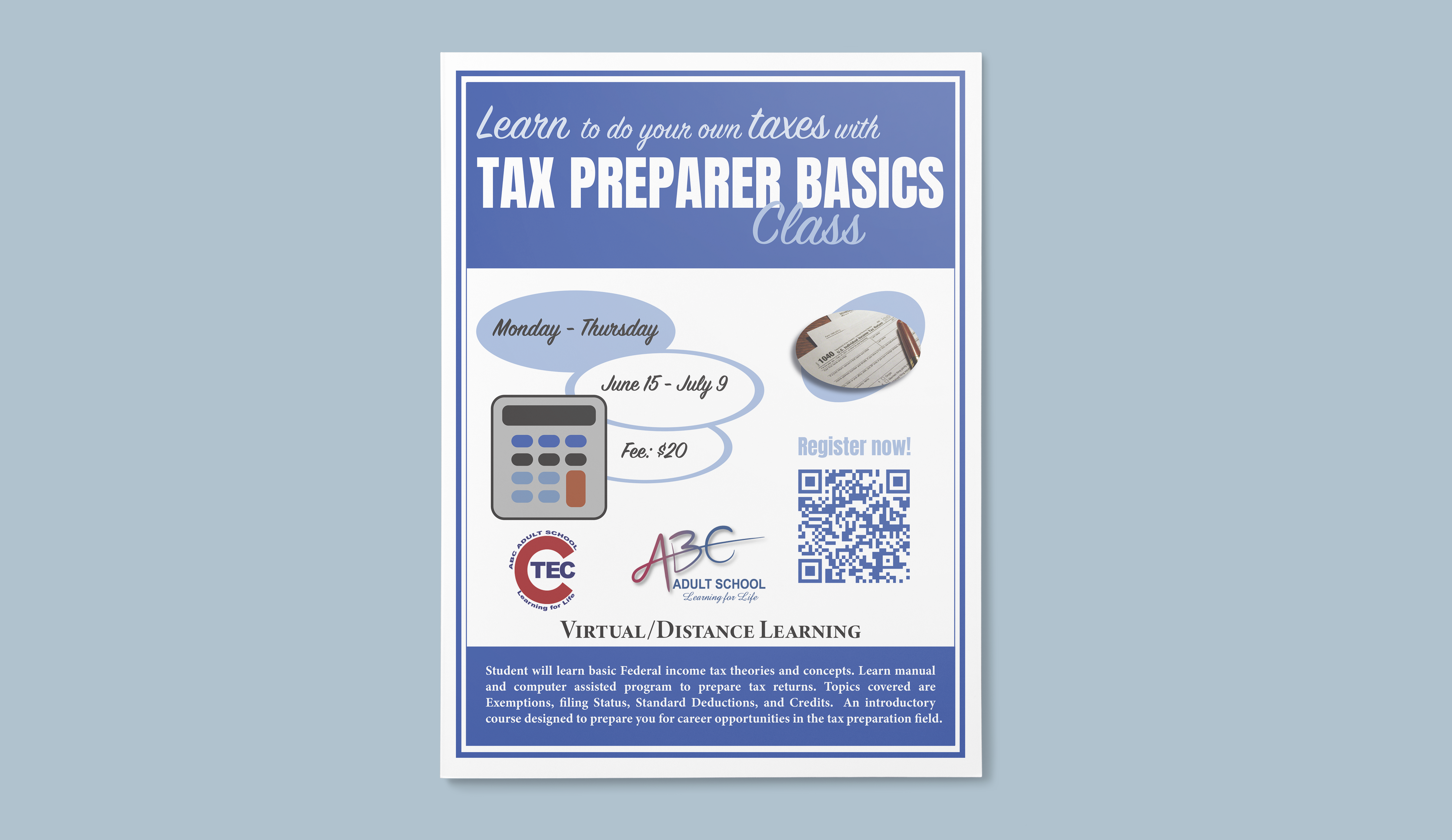
Fliers / Posters / Brochures
My process as a Graphic Designer has been one of experimentation with new techniques as well as a continuously refining and mastering of the core tools such as the Pen Tool. My precision with the Pen Tool has been useful when creating original vector graphics that are efficiently clean. I try to capture what inspires me from photography, and use my imagination to go beyond what a camera can capture.


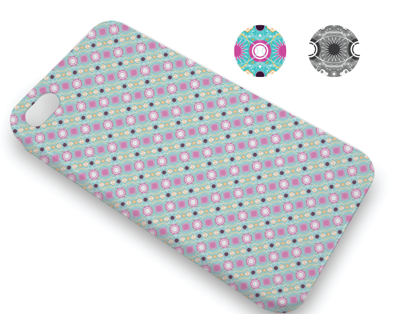
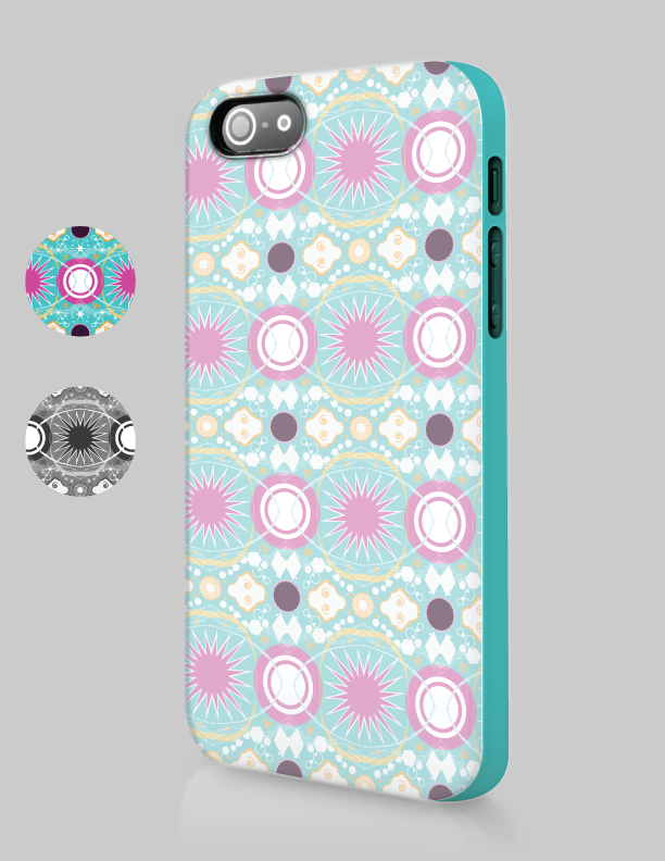
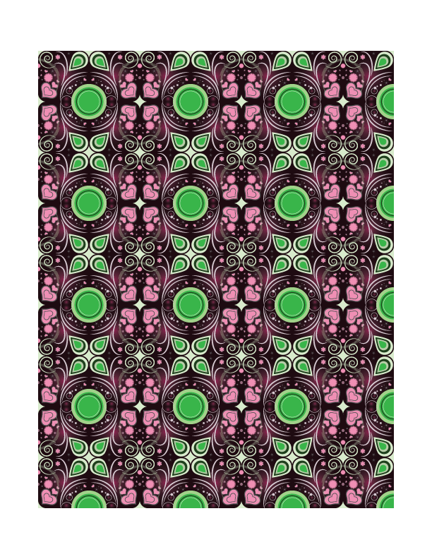
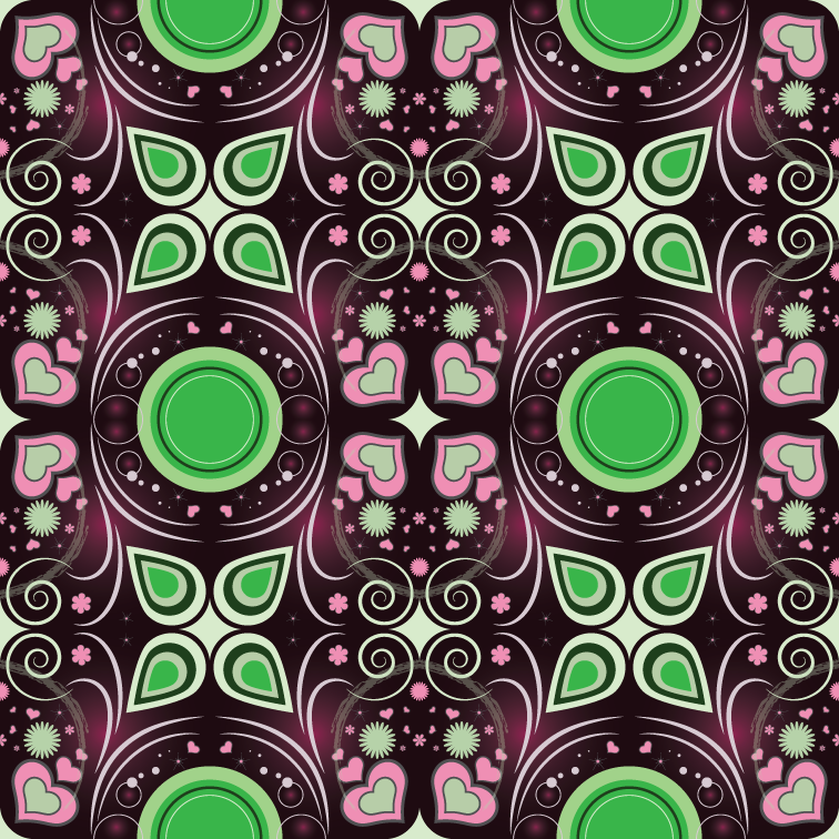
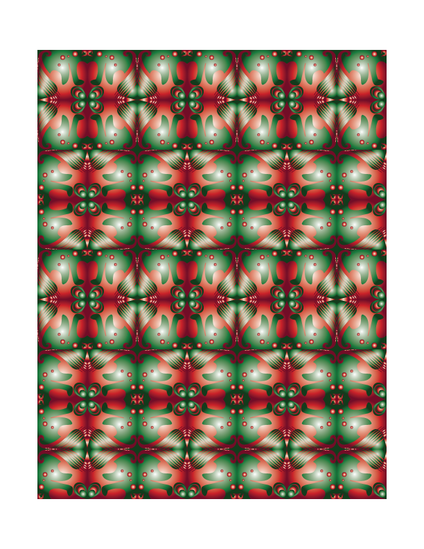
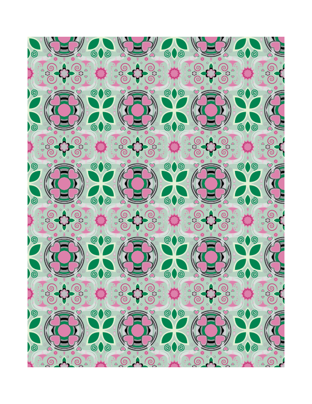
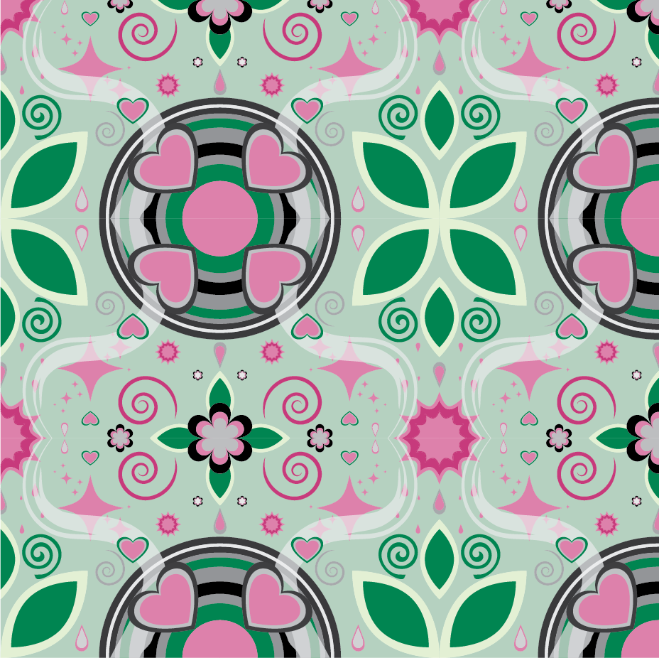
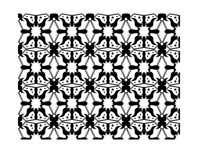
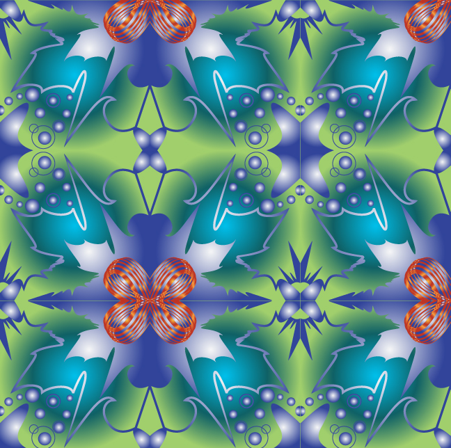
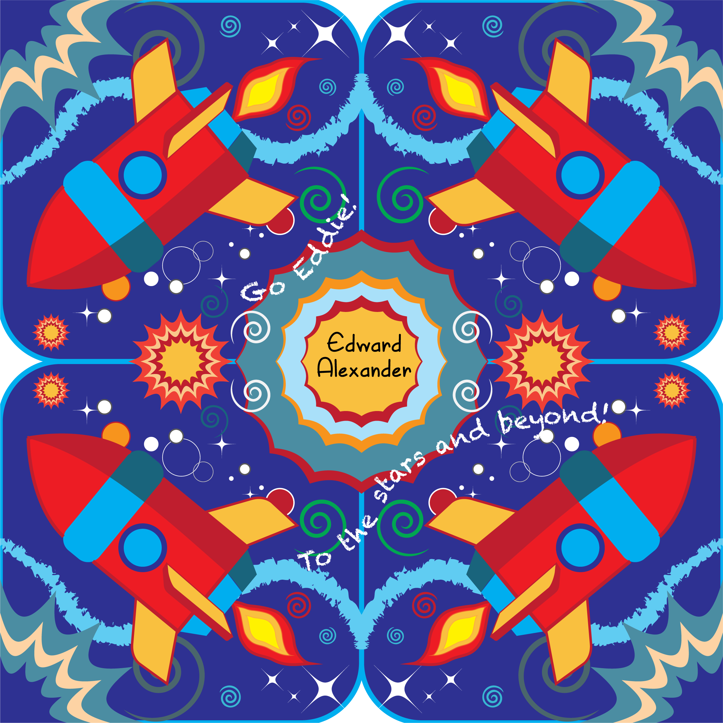
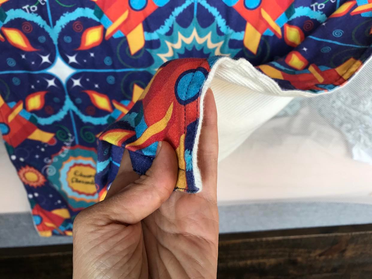
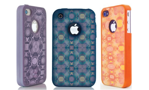
Pattern Projects
I designed these patterns for use as backgrounds that seamlessly repeat on websites, wall paper or textiles. I teach one simple method of pattern making by creating a one inch by one inch square tile and using pathfinder to crop of the edges. Next I duplicate and reflect the tiles to create a larger design as elements mirror each other to build a seamless repeating design.


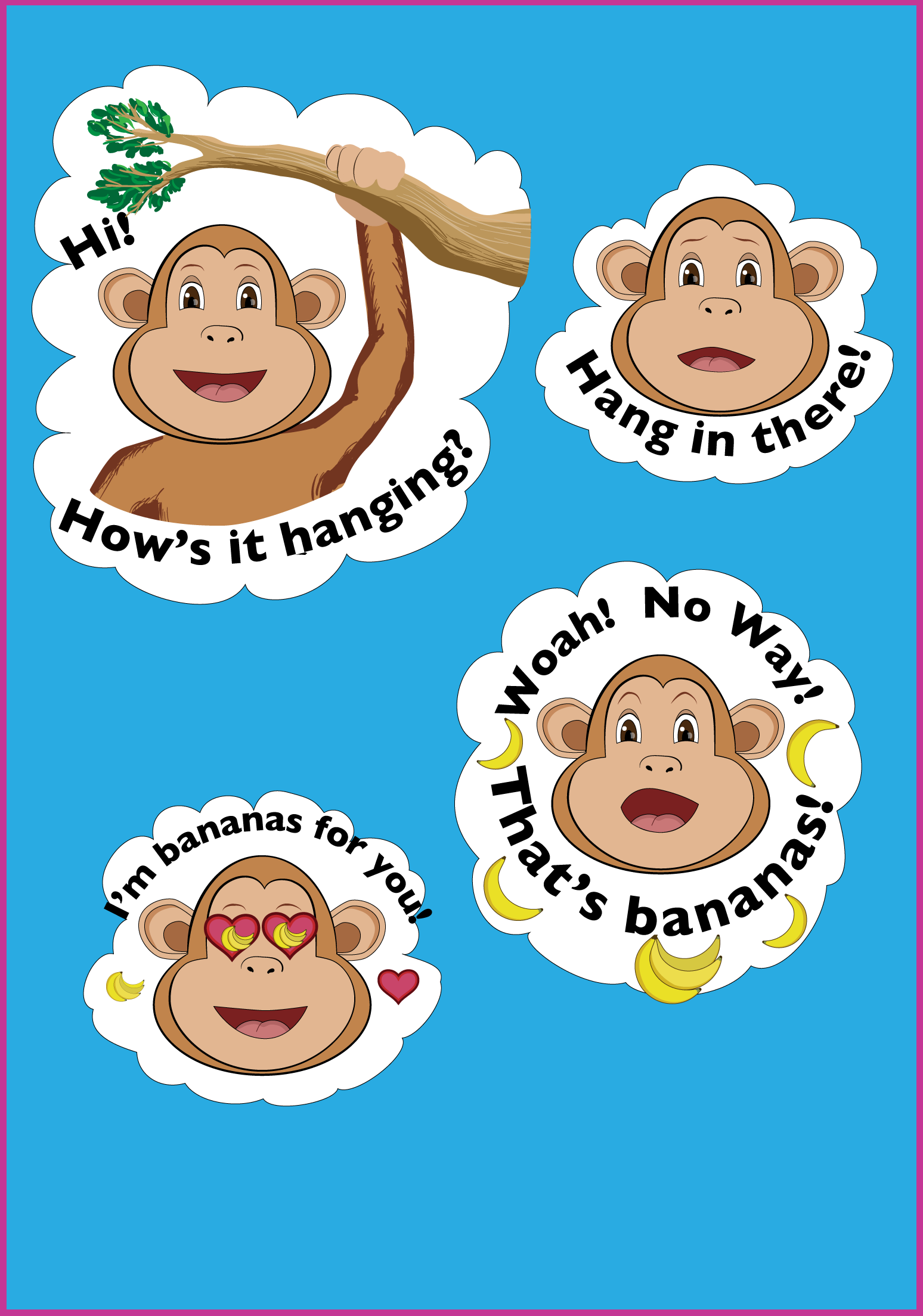
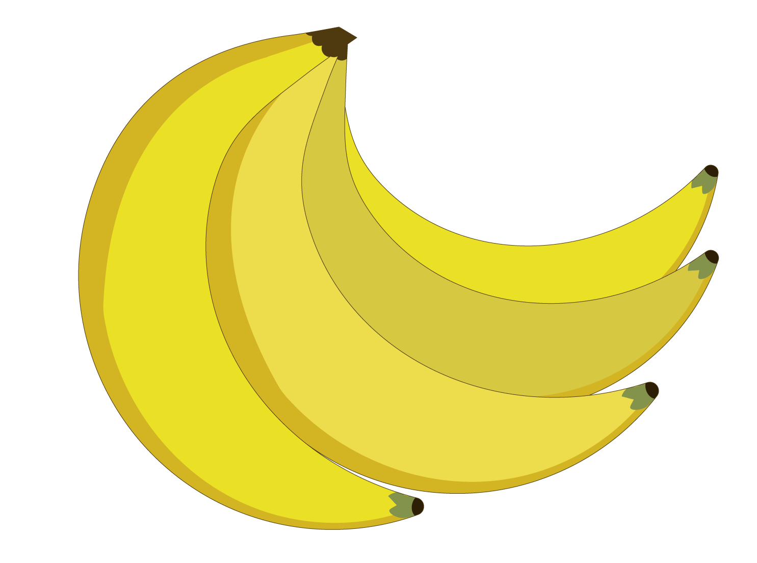
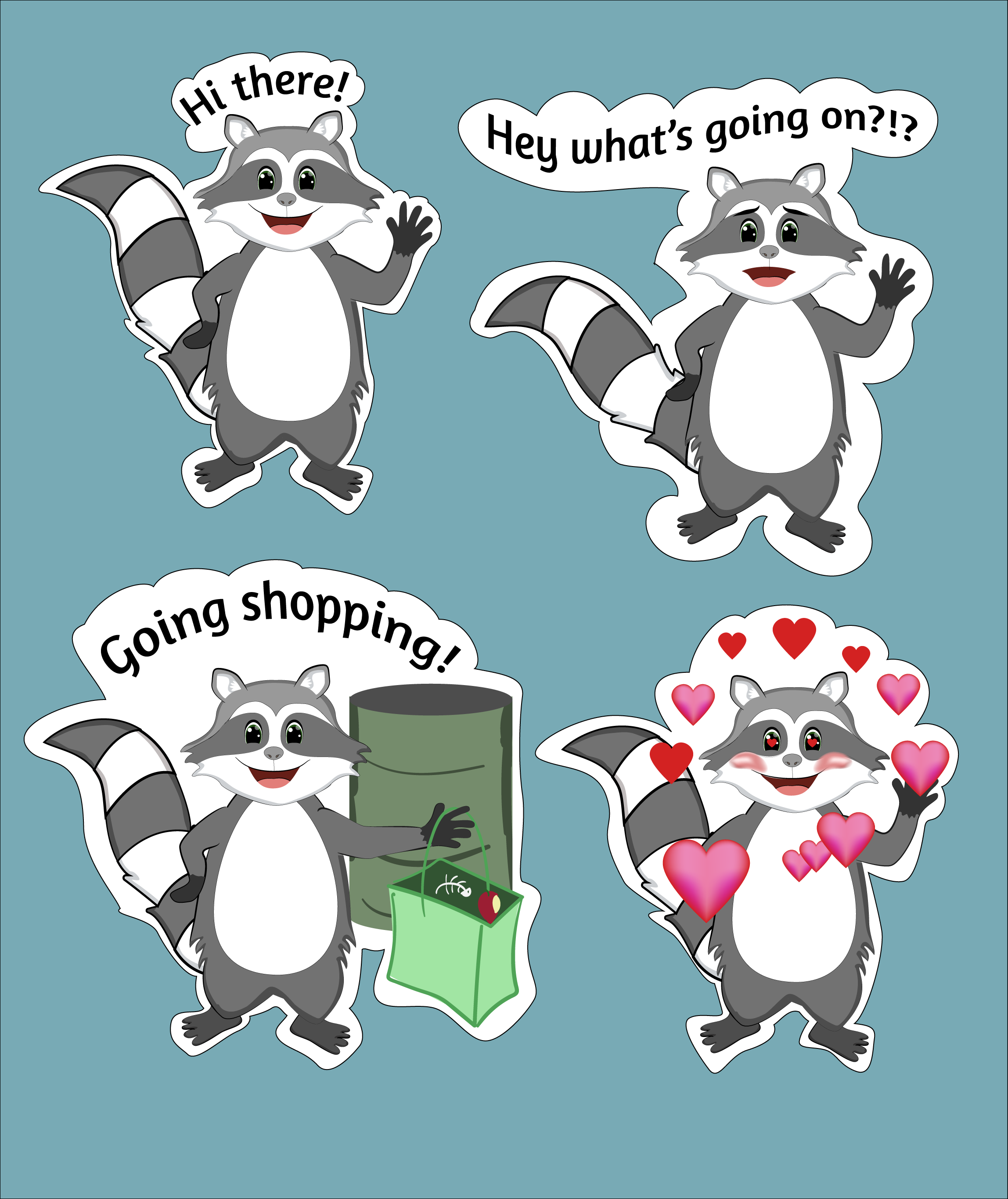
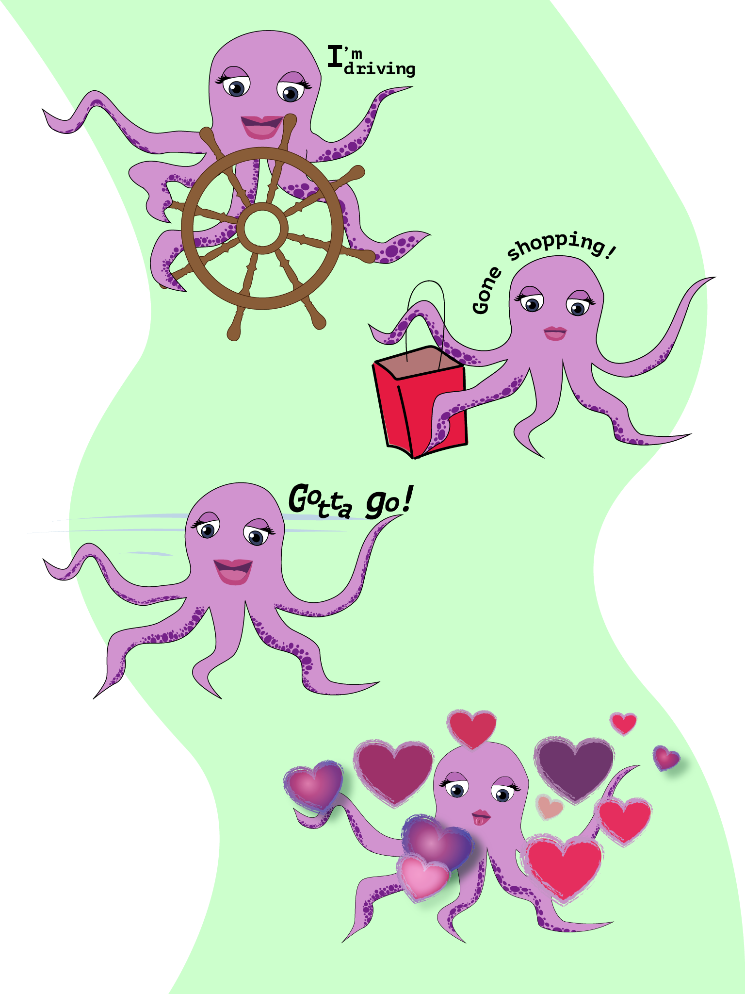
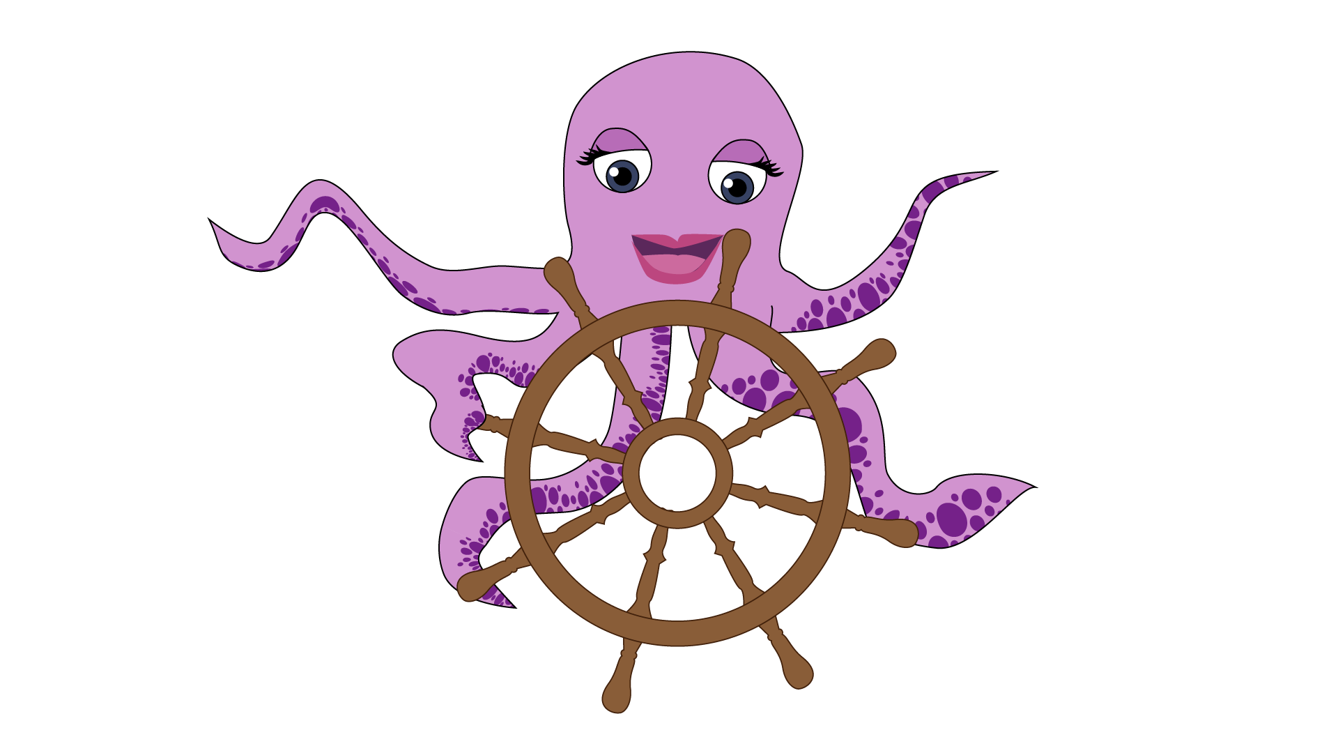
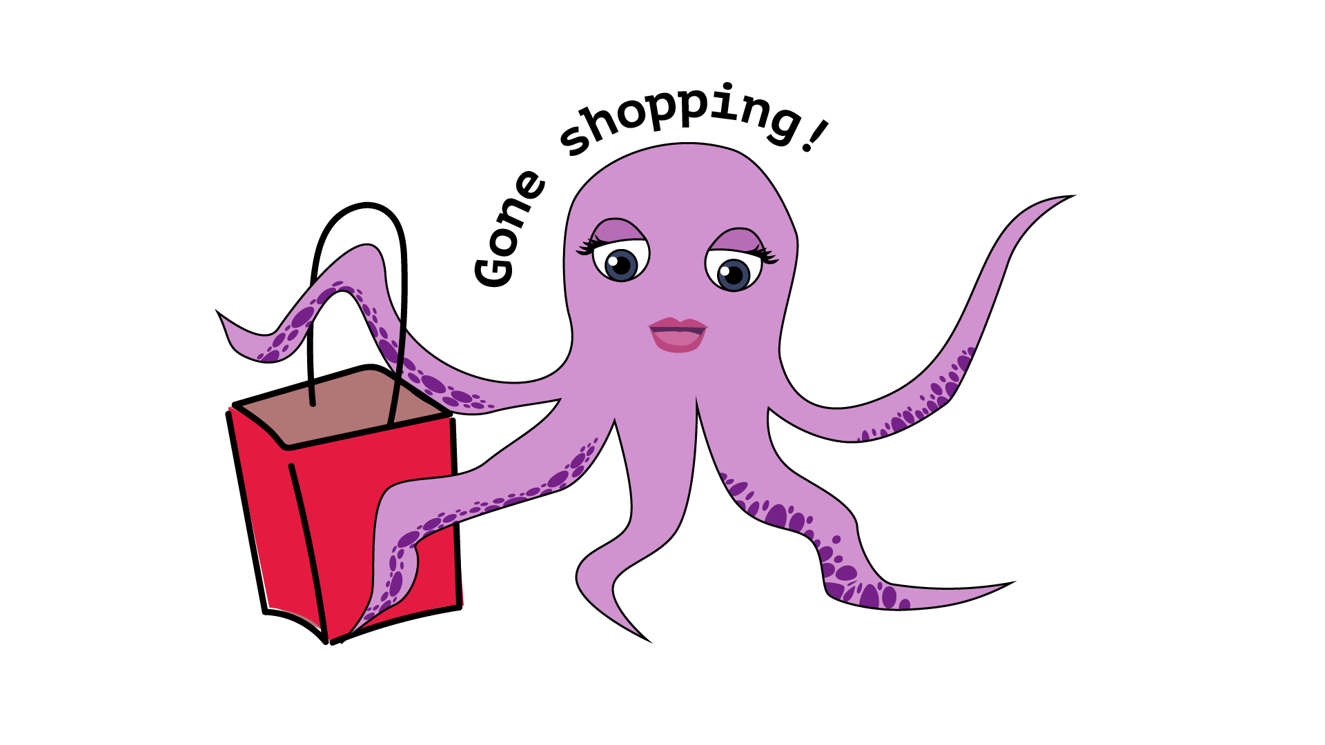
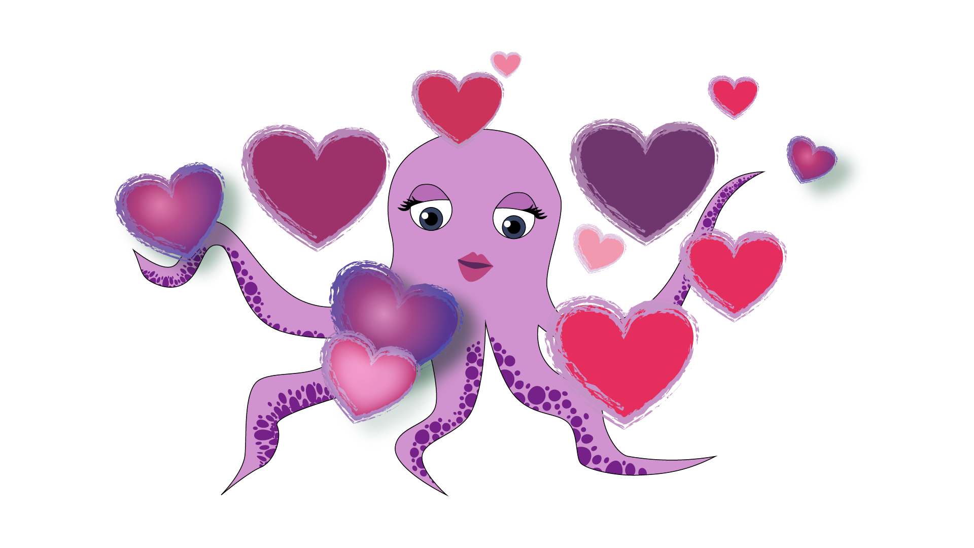
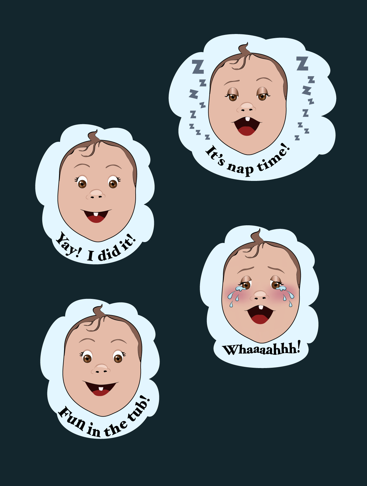
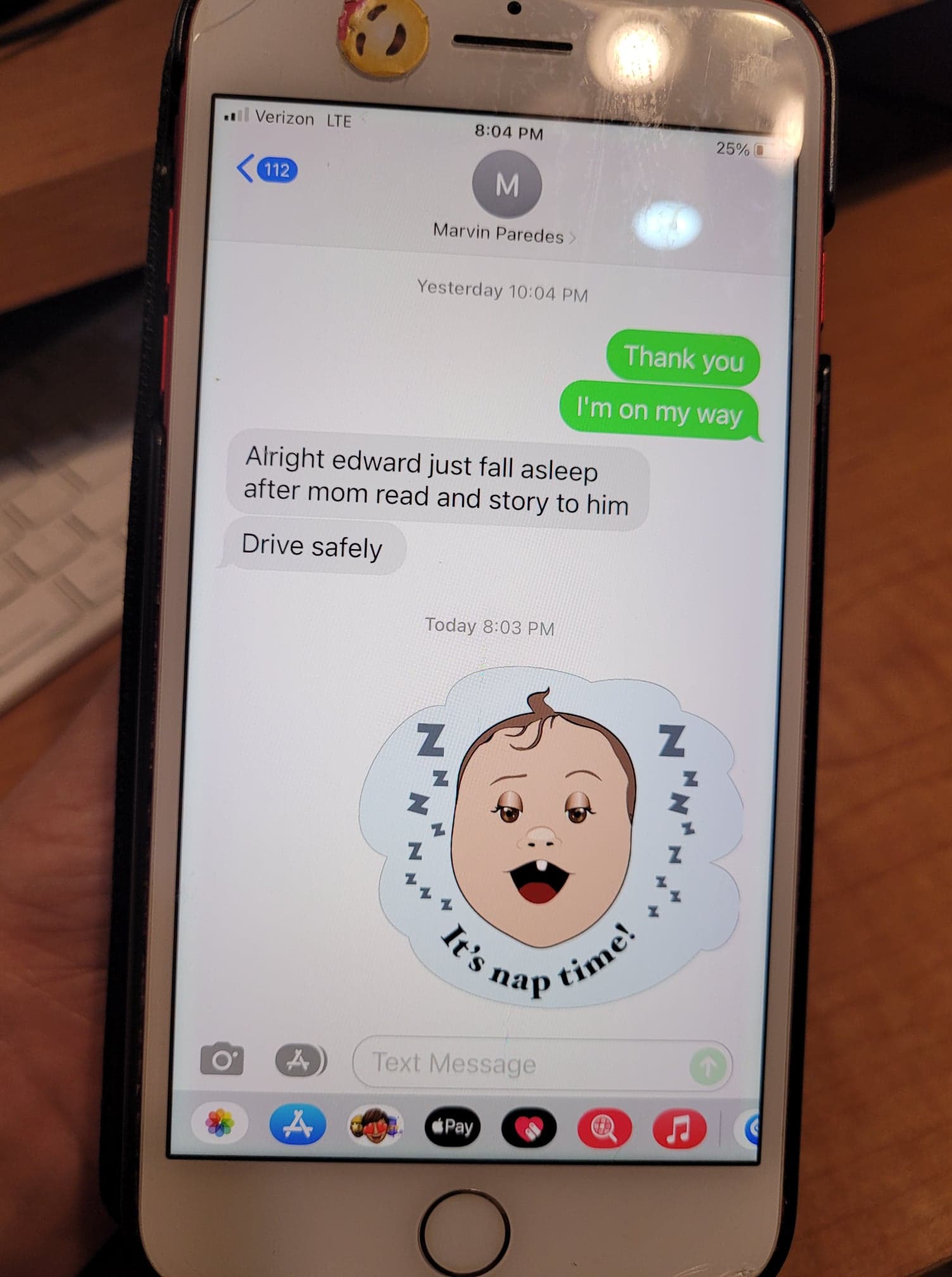
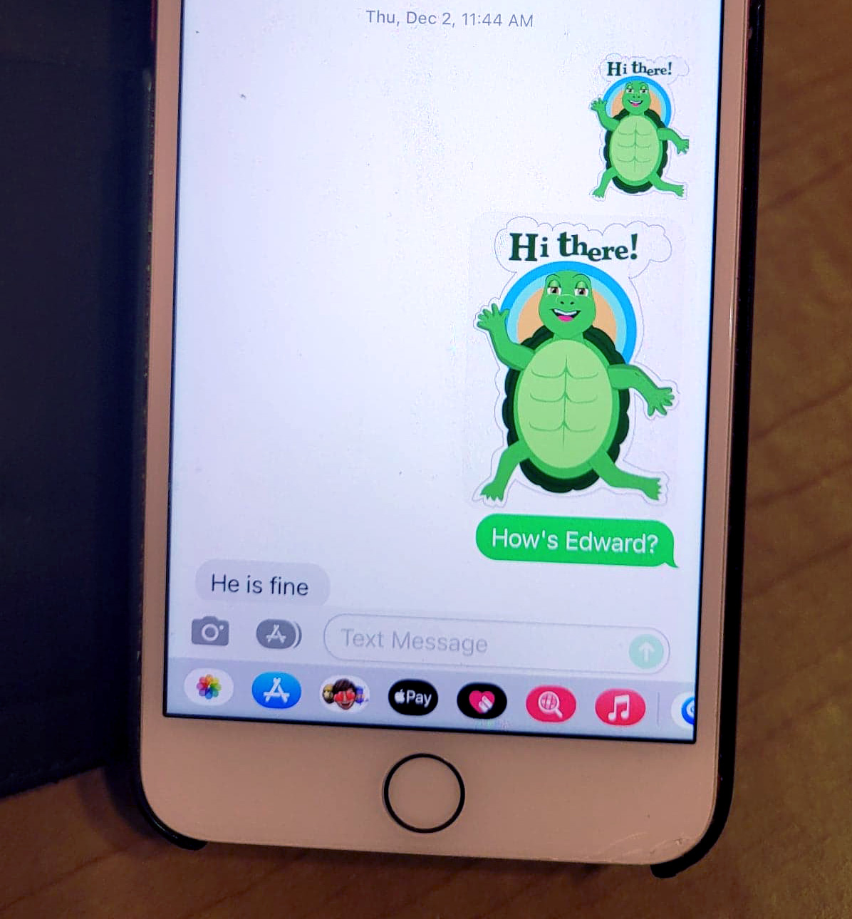
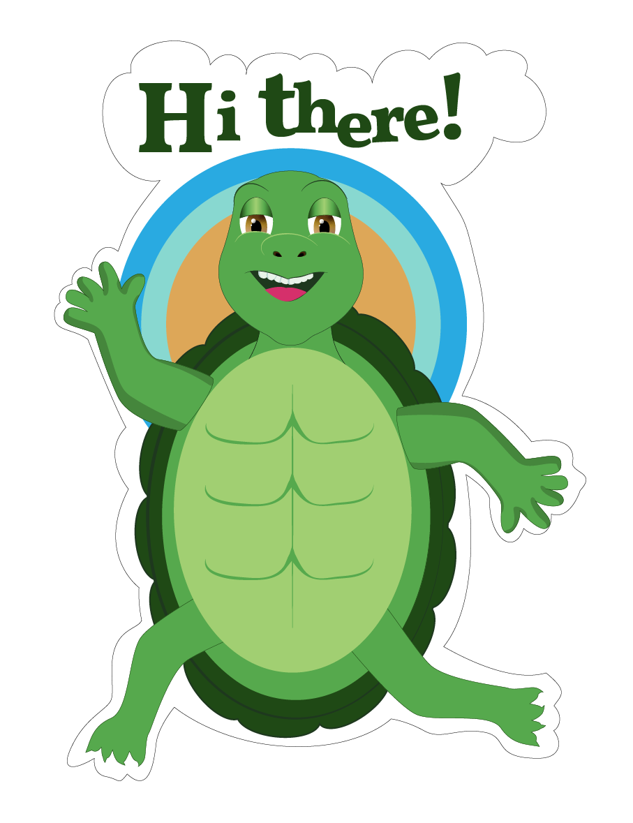
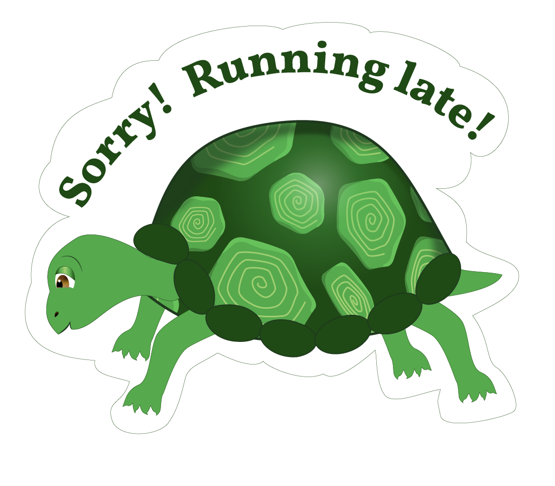
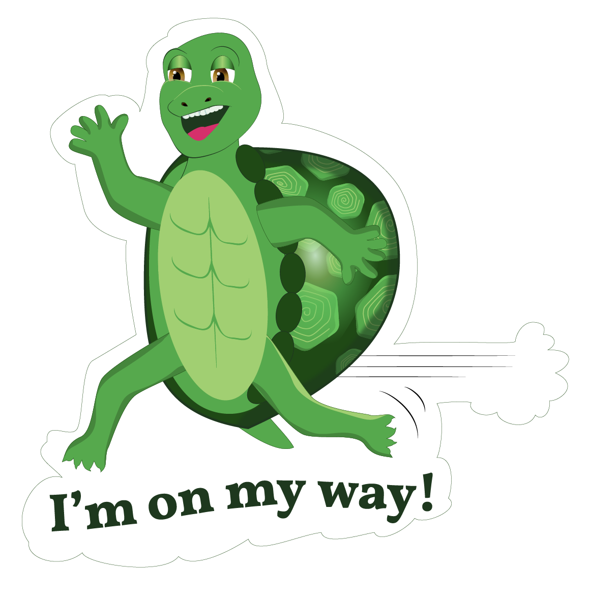
Emoji Design


I work with imagery in compositions to create a continuous flow of movement drawing the viewer’s eye throughout every part of the space. I use the direction and placement of imagery to entice and invite the viewer to read the text. When working with type, I am constantly looking at the relationship between positive and negative space and adjusting the sizes and spacing of characters to create a more interesting story with the text. I choose colors that make text stand out for legibility. I try to come up with clever visual concepts using metaphor or symbolism to create a memorable experience that conveys meaning.![]()
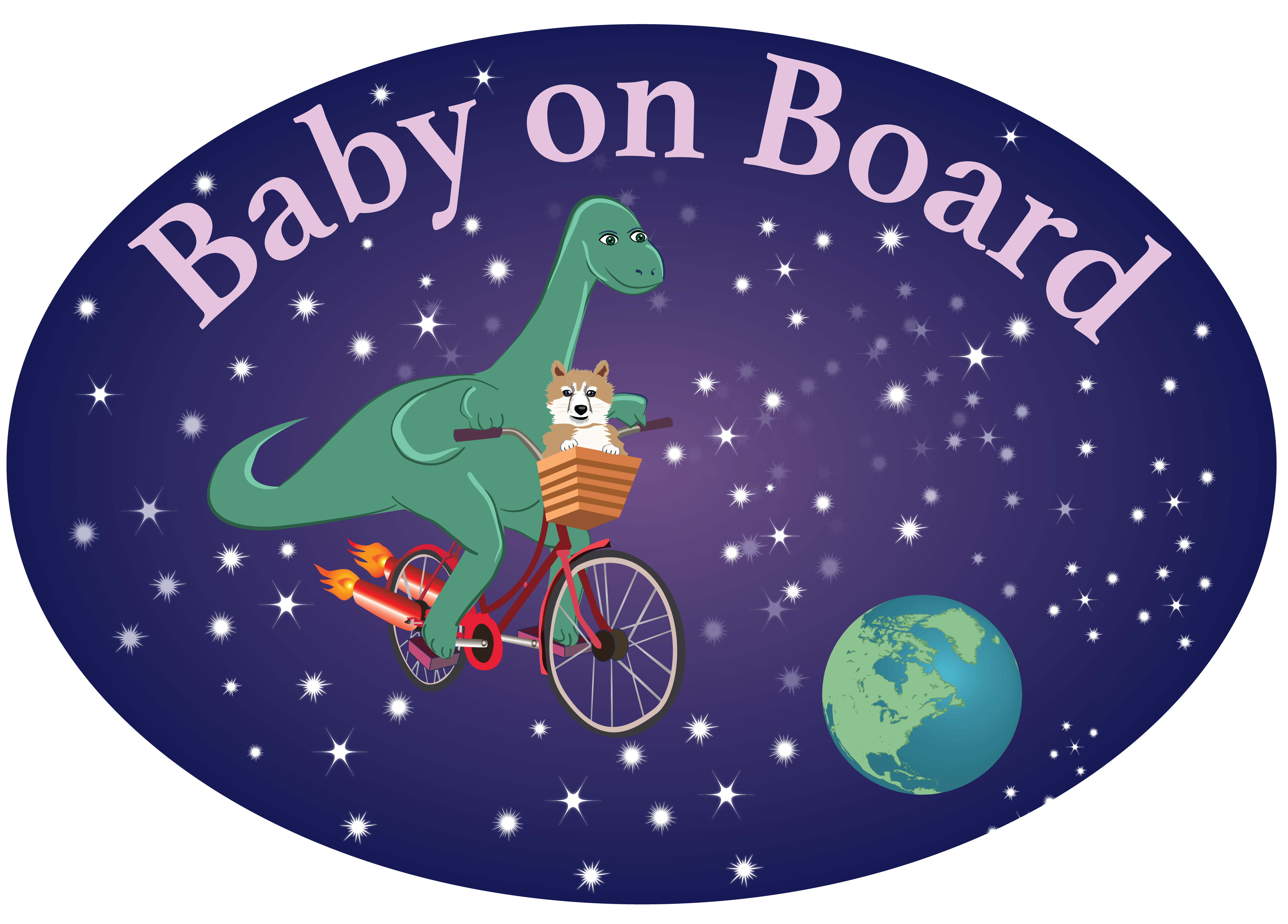
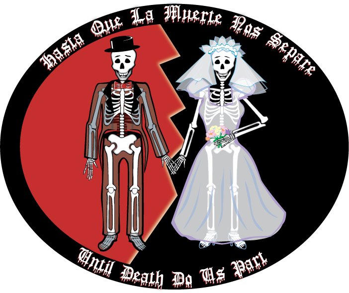
Simplicity for impact is usually the best approach for logo design. I imagine a logo on a billboard on the side of the highway. My goal is not to distract a driver causing a car crash. My goal is to create a logo that a driver can take a split second glance at and drive away with every essential detail of that logo leaving a lasting imprint on the mind.
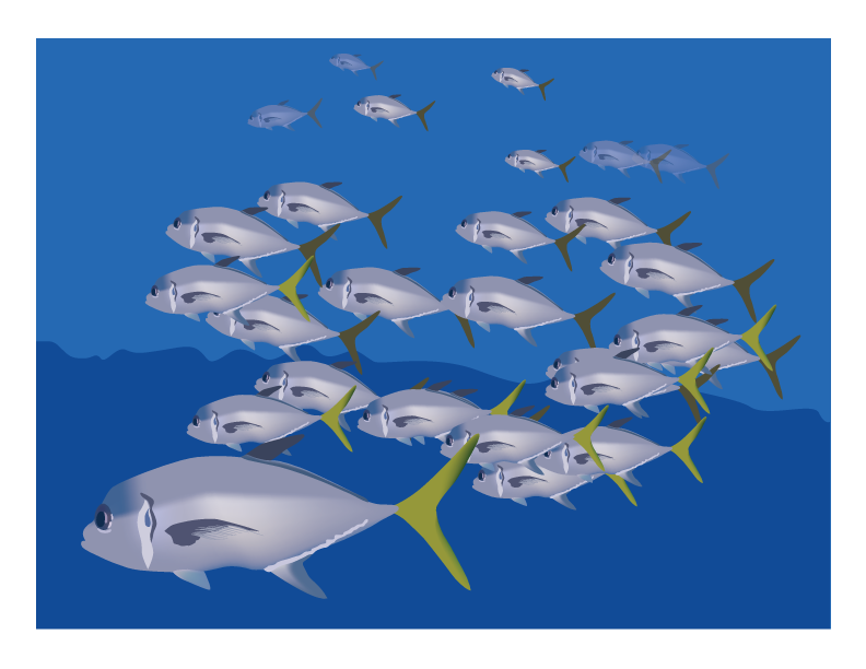
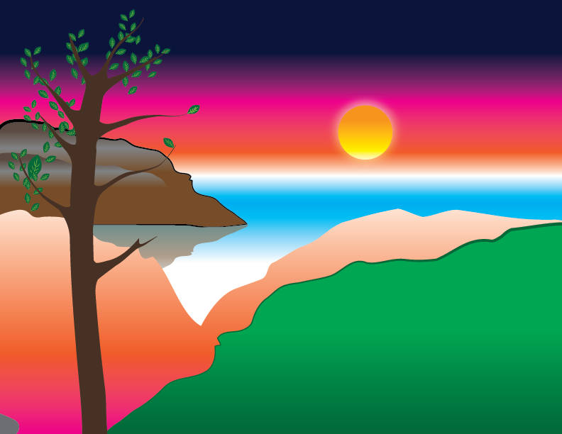
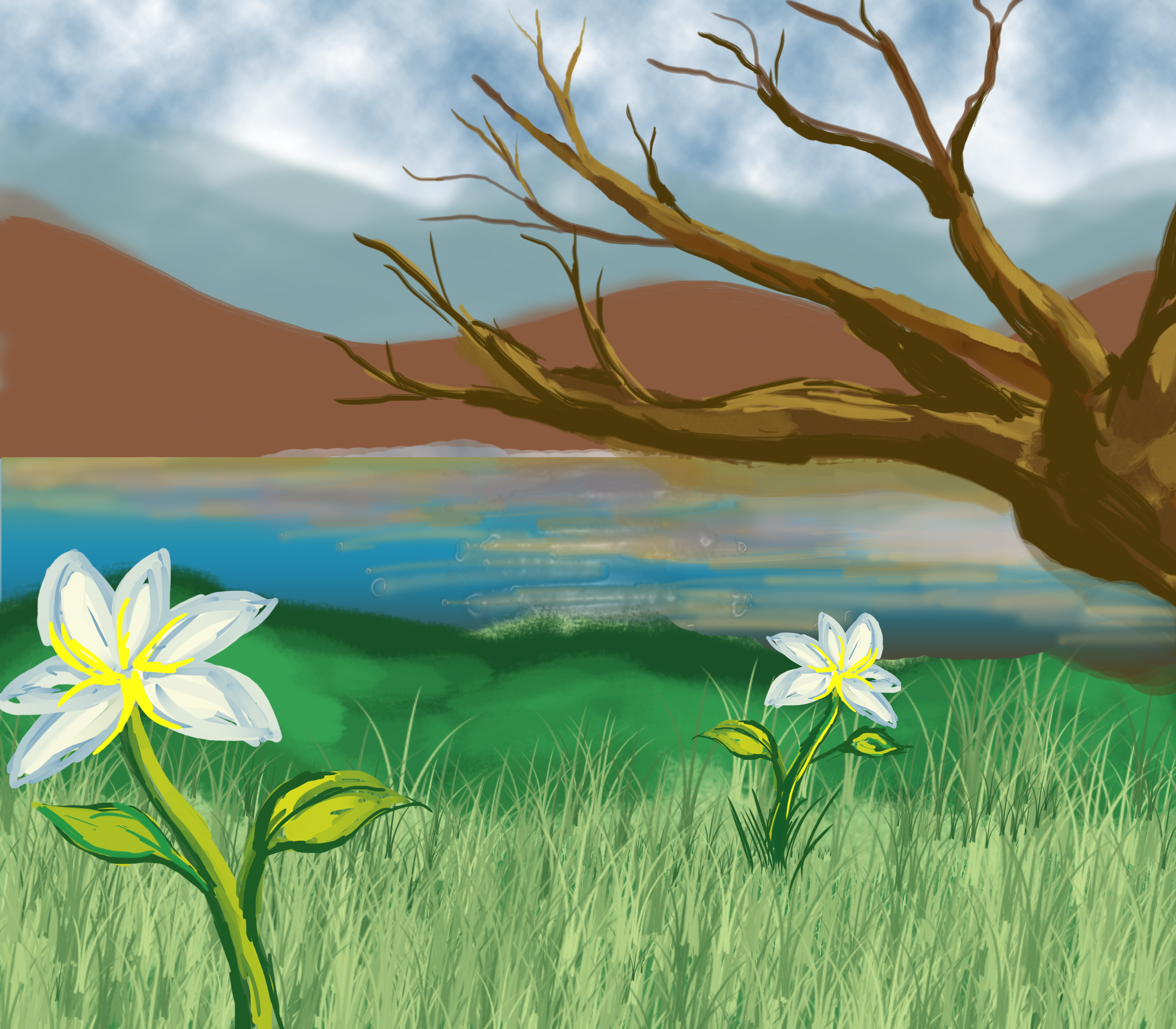
Digital Drawings


Click to see Button Slide Show
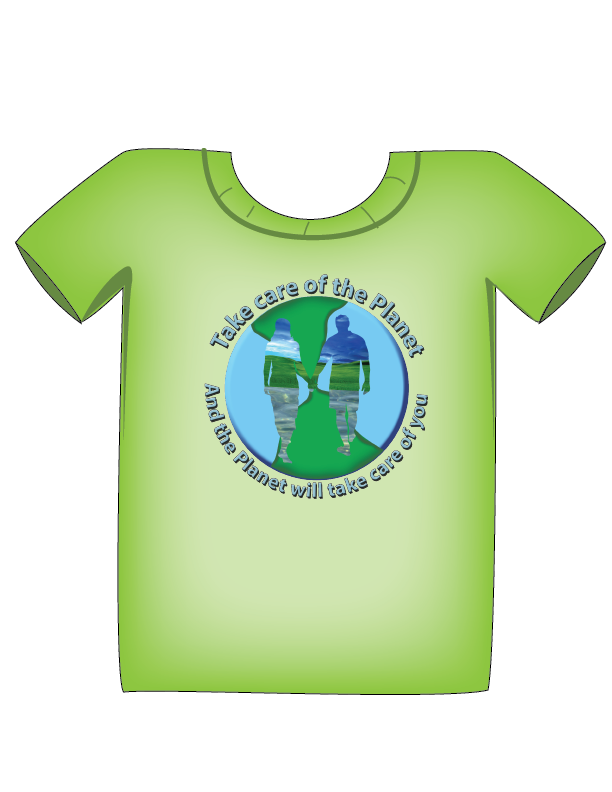
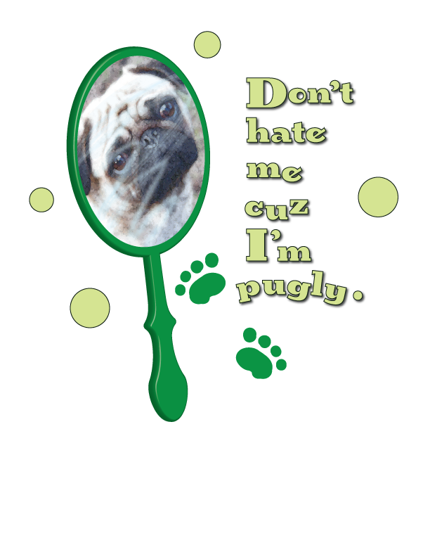
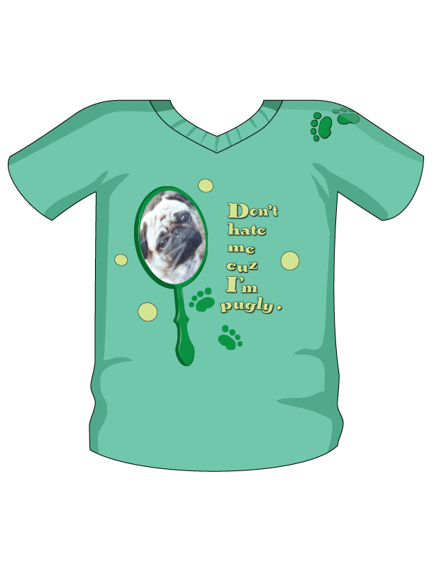
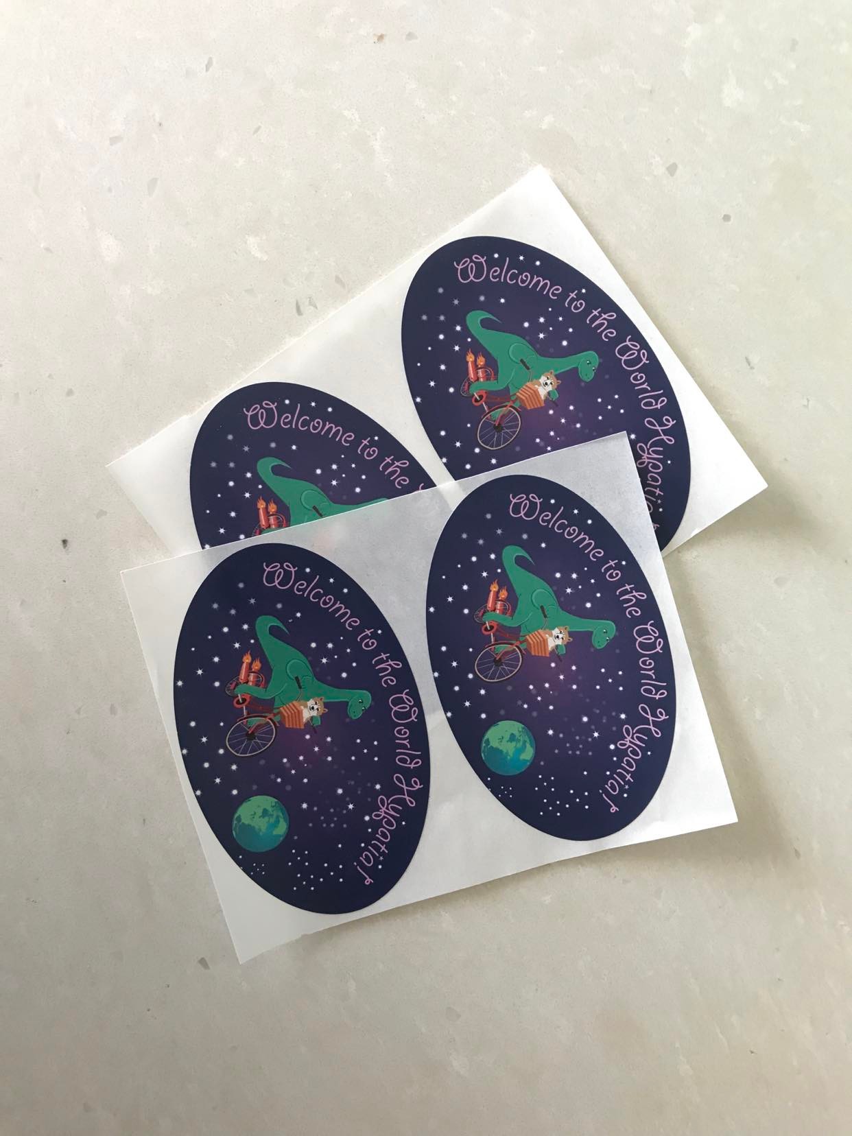
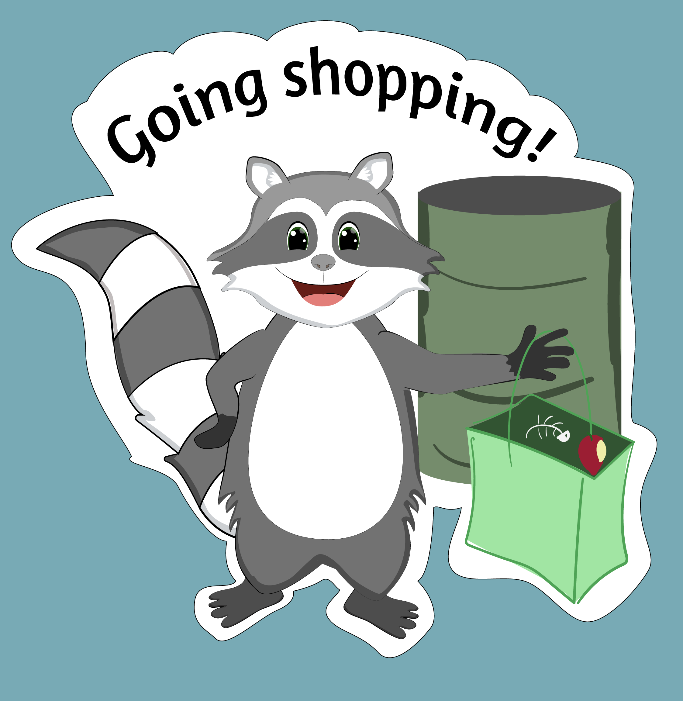
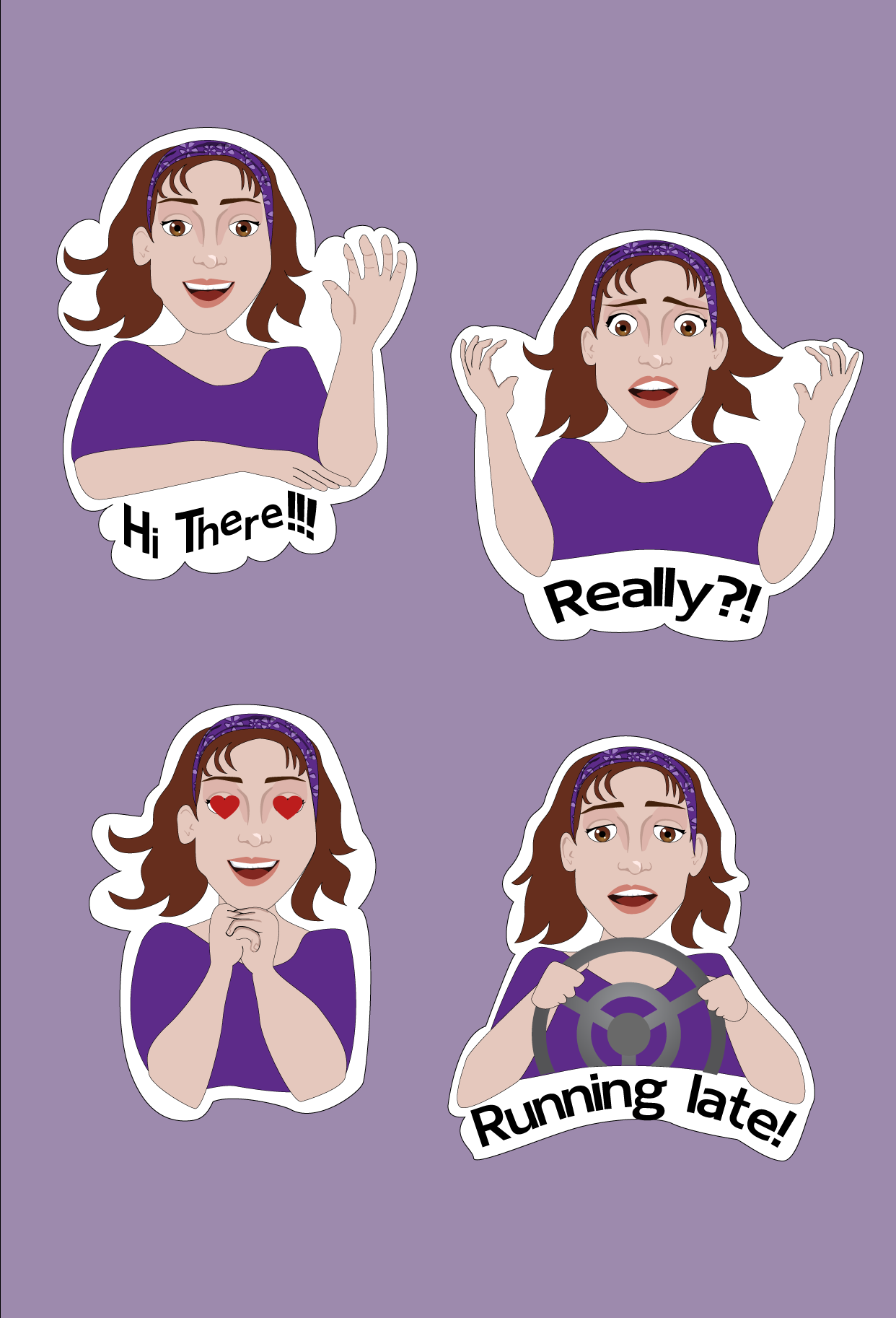
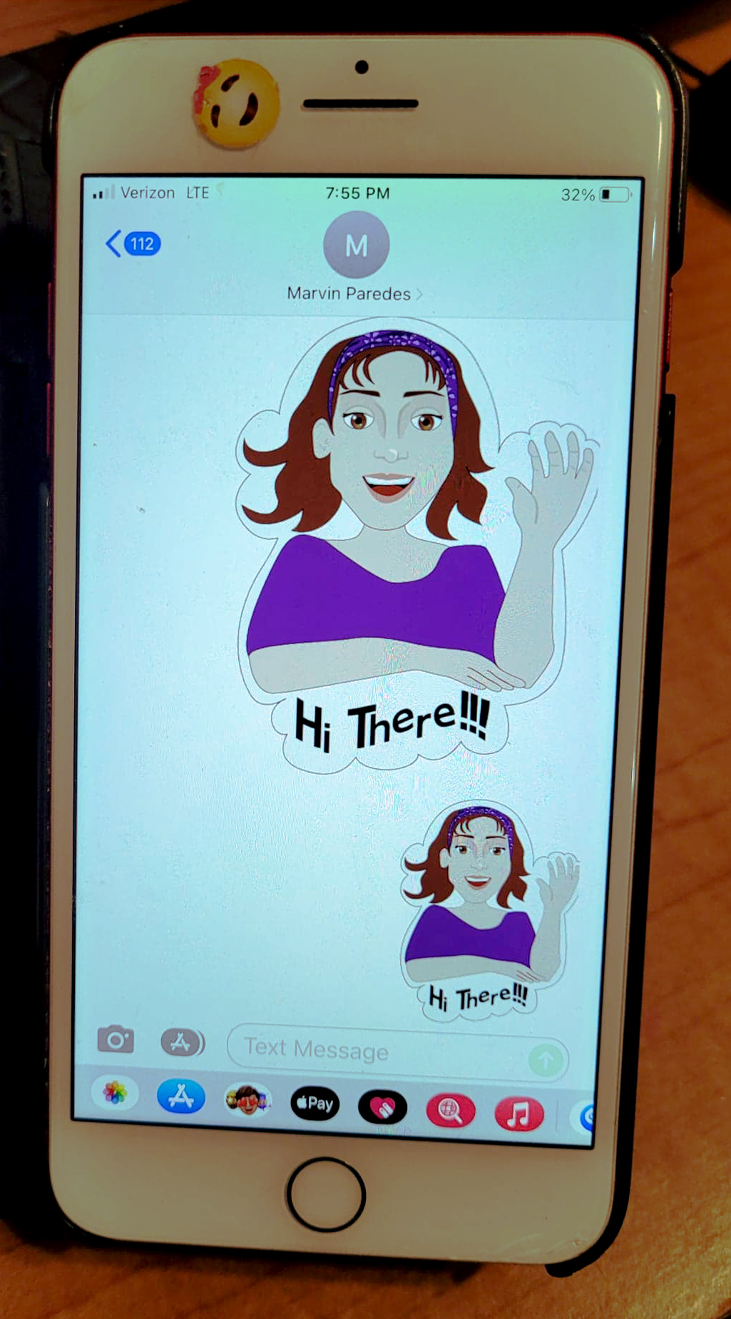
T-Shirt Design/ Sticker Design